View MEND
✦
Thank you for reading!
Want to talk about Valorant UX+ or other projects?
You can find my contact information here.
View Bento
Buddy
what's next?
Add a voice-based match reflection feature.
Experiment with AI-curated performance tips tied to recent games.
Extend post-match tools to support different player moods and energy levels.
Explore emotion-aware UI modes for different levels of in-game stress or tension.
what i learned?
Simplicity builds player confidence, especially when emotions run high.
Emotional UX in gaming isn't about adding excitement, but reducing friction.
Language shapes experience, a supportive message can ease tension more than a stat screen ever could.
This project shifted my mindset from “how do I optimize gameplay” to “how do I help players feel understood, even when they lose.”
6
Reflection


From low-fidelity clarity to a polished, emotionally aware experience
After creating my hand-drawn low-fidelity wireframes, I conducted an initial round of user testing to validate the core layout and information flow. Feedback confirmed that users appreciated the simplicity and intent, but wanted clearer feedback moments and stronger visual cues during the post-match experience.
I then moved into high-fidelity wireframing, introducing a full visual system that balanced Valorant’s bold identity with a calmer, more encouraging tone. This included softened UI elements, focused layouts, and accessible typography to help players stay engaged without feeling overwhelmed.
Following usability testing with the high-fidelity prototype, I identified key areas to improve: button contrast, the flow of post-match insights, and the visibility of agent-related feedback. Based on this, I iterated on spacing, color emphasis, icon clarity, and transitions between screens. You can view the full usability test plan and results here.
The result is a final prototype that supports reflection, growth, and confidence. Valorant UX+ delivers personal insights, frictionless onboarding, and emotionally aware interactions, all without interrupting gameplay or increasing pressure.
5
Final
Building support into every screen
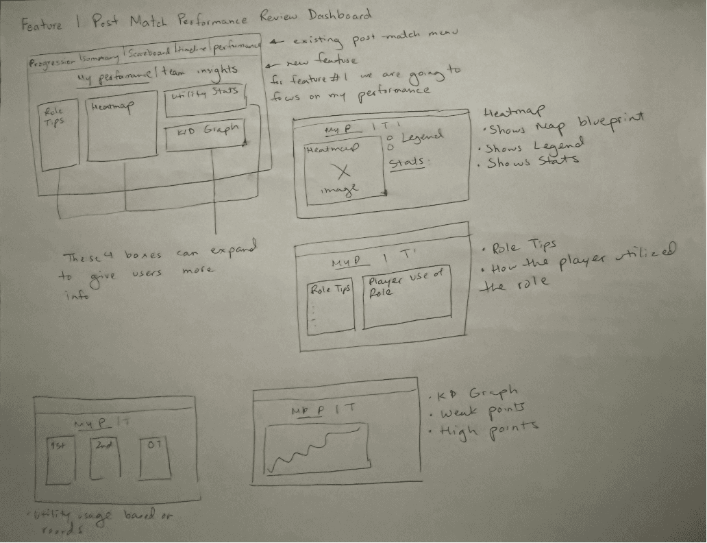
These hand-drawn wireframes visualize two core experiences designed to help players reflect without feeling overwhelmed.
• Team Loss Breakdown shifts the focus from individual blame to shared patterns like site holds, trades and post-plant outcomes
• Performance Dashboard gives a clear snapshot of each match through an expandable layout featuring KDA map, role-specific tips, utility usage and a graph of performance over time
Each screen is intentionally simple, keeping information digestible and emotionally neutral. Sketching by hand helped maintain that focus by prioritizing clarity, pacing and psychological ease over visual polish.
Performance Feedback & Growth Tools
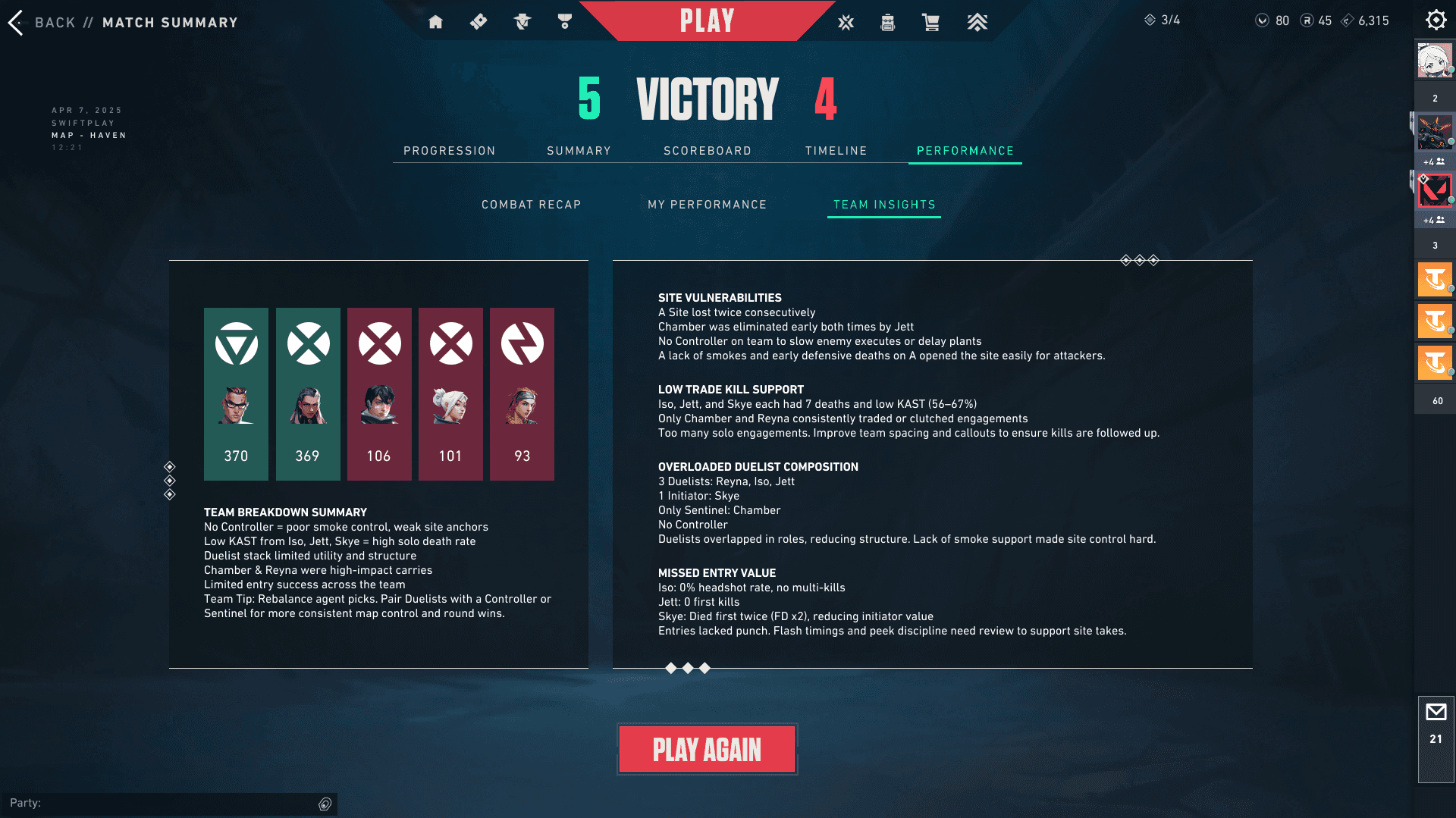
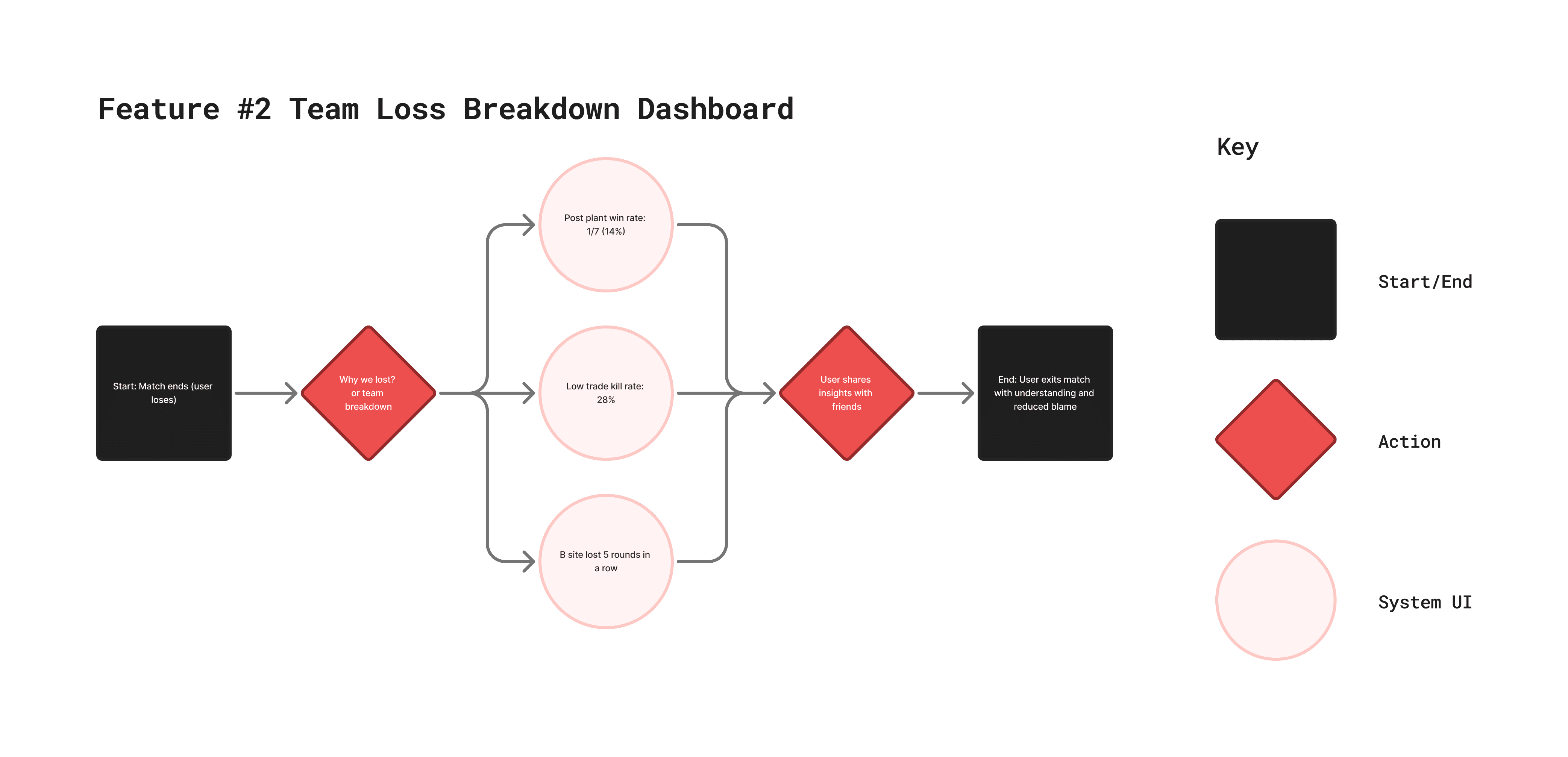
"Why Did We Lose?” Summary Screen (Medium Priority)
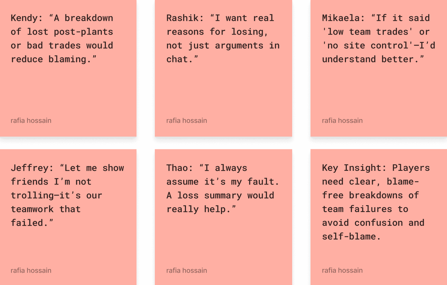
A team-level breakdown that highlights what went wrong without pointing fingers. Includes:
Post-plant win/loss rate
Site defense success
Trade kill %
Heatmaps of key site engagements
Why it matters:
After losses, players often feel confused or blamed. This screen fosters team learning and reduces toxicity by showing tactical breakdowns clearly. While highly valuable, it’s more complex and should follow the personal dashboard for smoother adoption.
Performance Feedback & Growth Tools
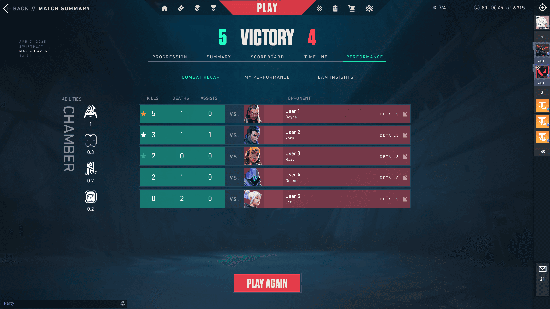
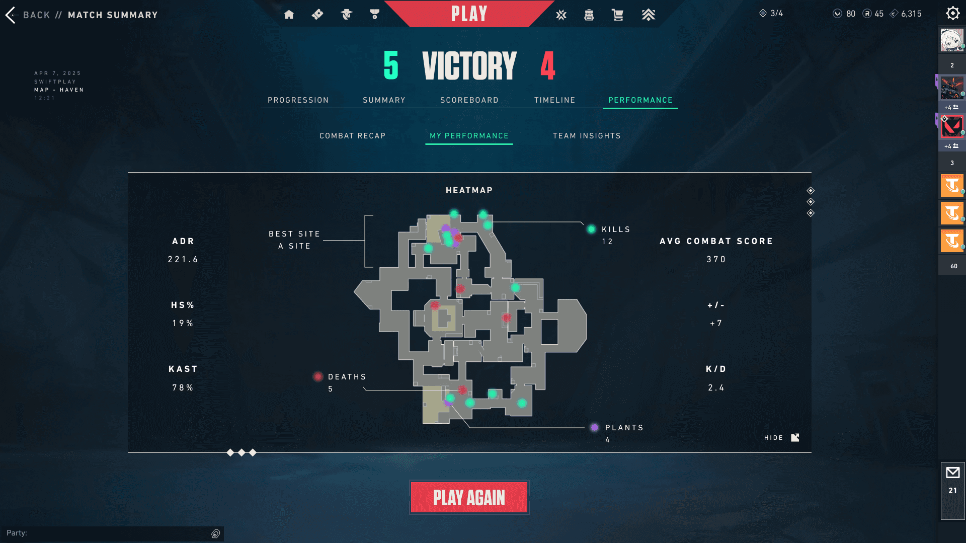
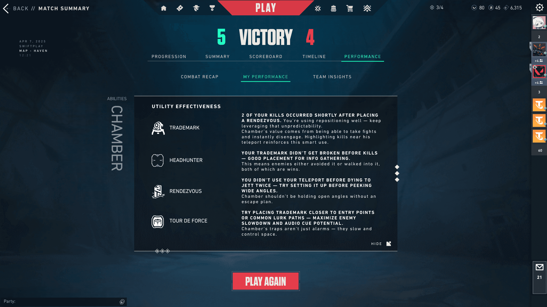
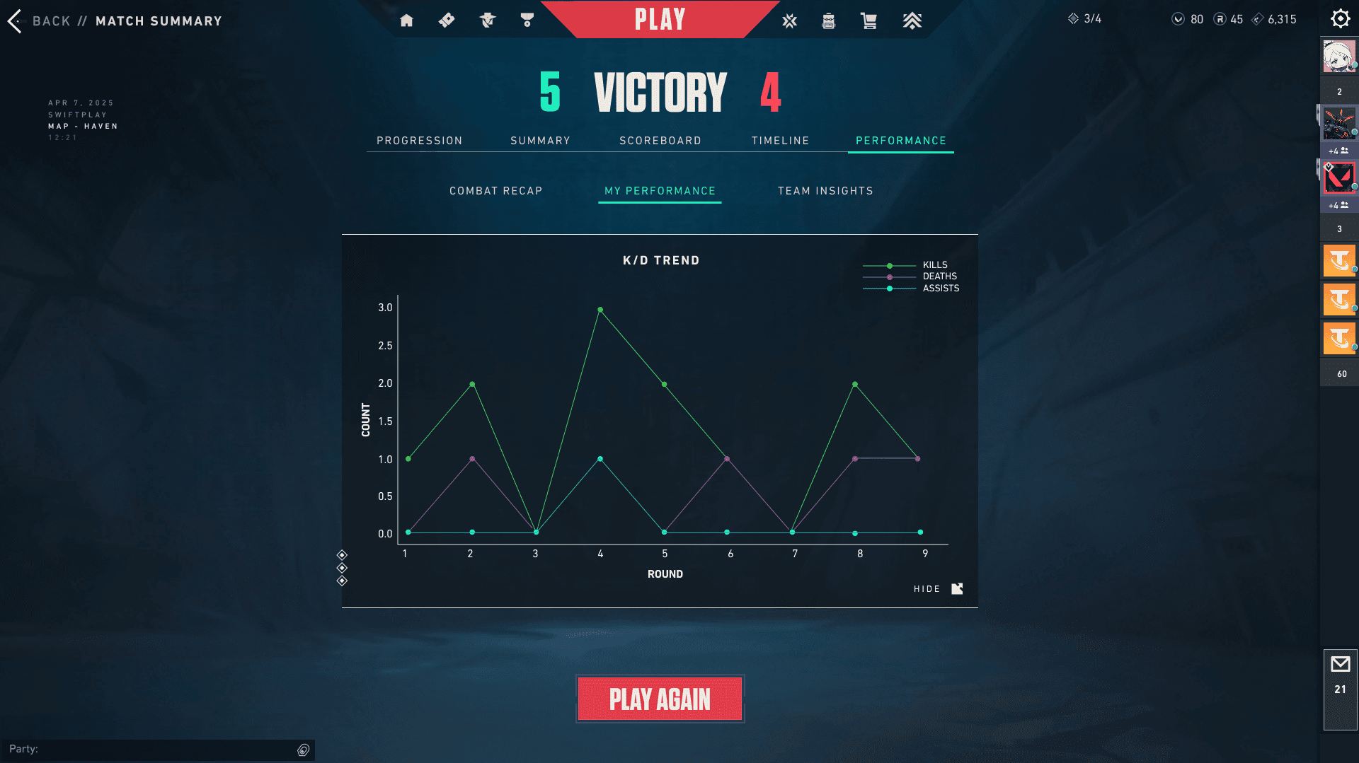
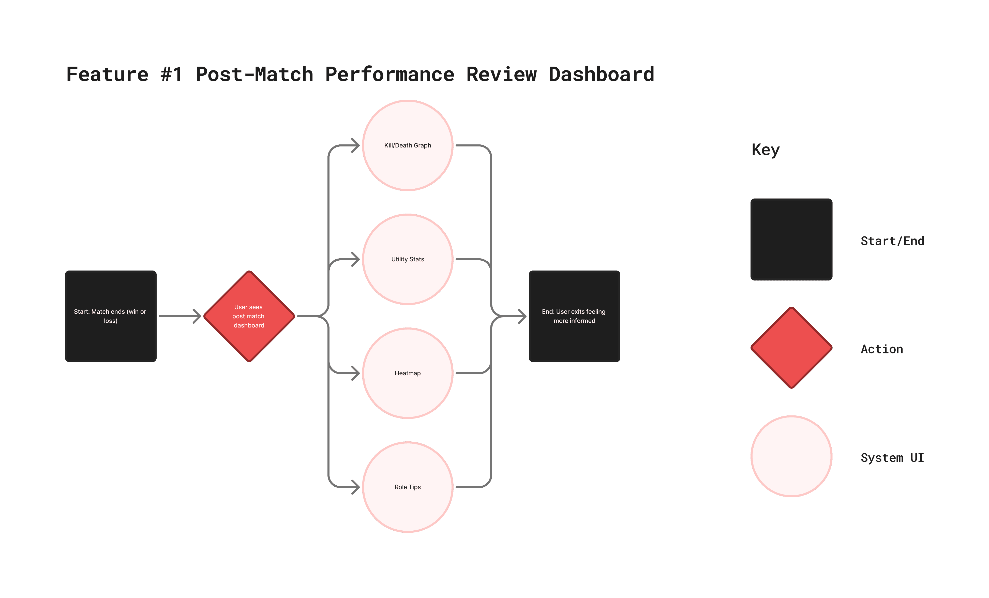
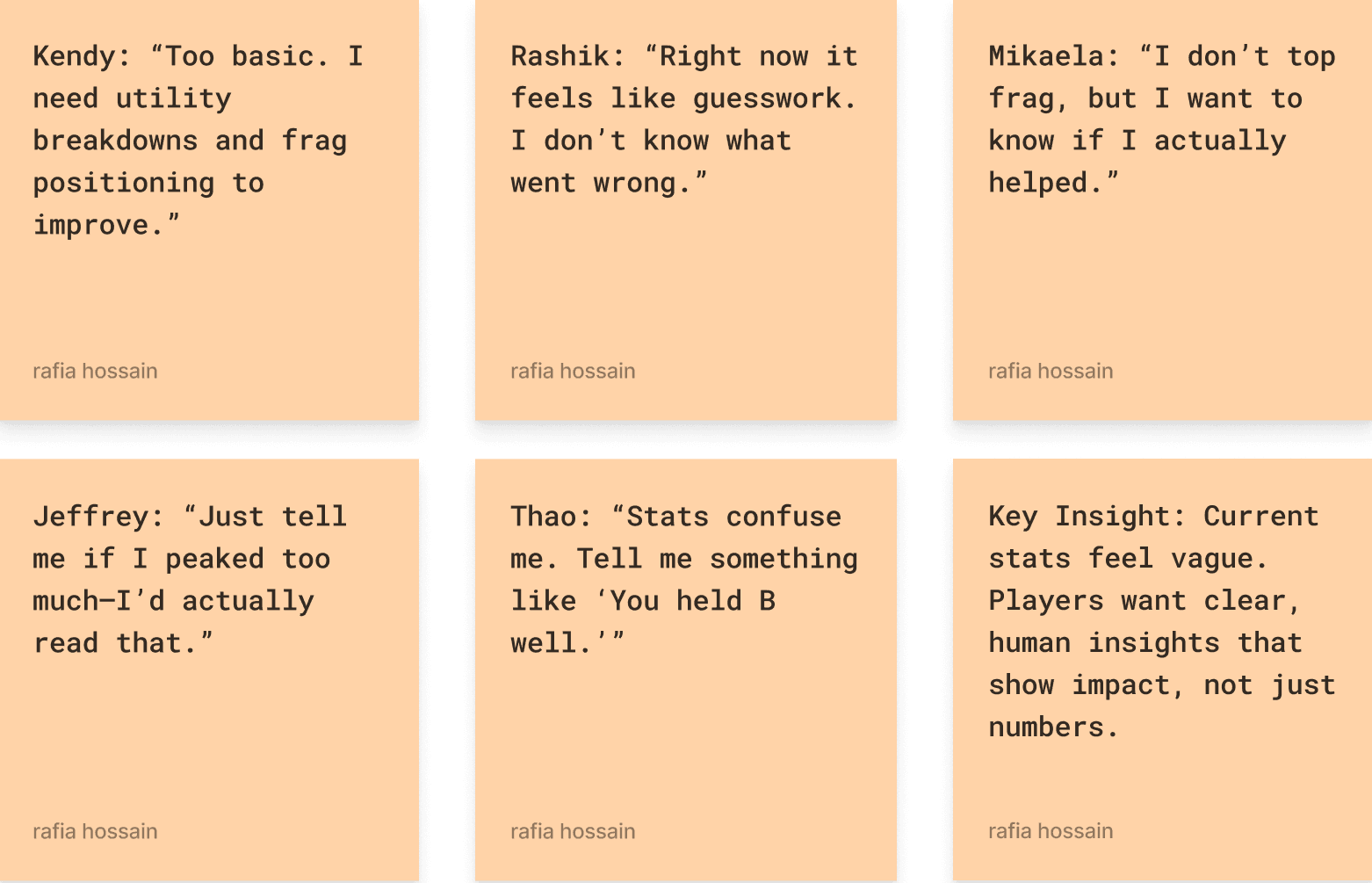
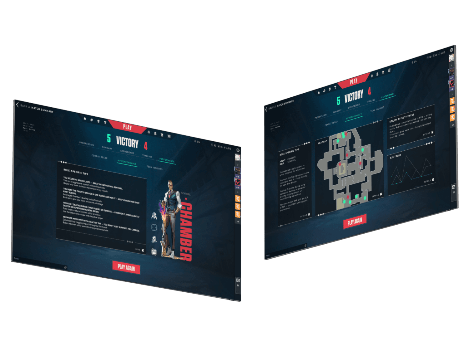
Post-Match Performance Review Dashboard (High Priority)
An enhanced post-match screen tailored to each player’s role (e.g., duelist, controller, sentinel). Key features include:
Kill/death graph
Engagement heatmap
Utility effectiveness (% of flashes hitting enemies, etc.)
Mini insights like “You smoked late 3/4 times” or “Try trading more”
Why it matters:
Players across all skill levels wanted clearer, more actionable feedback. This dashboard helps users understand how they performed and where to improve, using data Valorant already tracks, making it a feasible and impactful feature that boosts retention and self-driven growth.

4
Design
I created two user flows to map how someone like Rashik would interact with the product at critical moments.
Feature #1: The Post-Match Performance Review Dashboard helps him understand his impact with clear, context-rich stats that feel human and not overwhelming.
Feature #2: The Team Loss Breakdown Dashboard guides him through why the team lost, using agent-aware tips and gentle prompts to reflect and grow.
These flows shaped an experience that feels constructive, emotionally aware, and tailored for players who want to improve without feeling judged.
Affinity mapping
Turning player emotions into design direction
To bridge the gap between research and gameplay, I began organizing user frustrations and needs into a foundation for Valorant’s UX improvements.
I used an Affinity Map to cluster insights from interviews into themes like why the team lost, emotional load and learning confidence, and post-match performance feedback.
3
Ideate
✦
Design Goals
Create a low-pressure way to reflect after each match.
Prioritize clarity and confidence, not performance stats.
Offer gentle suggestions for improvement, not blame or critique
Make everything optional: no forced tutorials, no ranked pressure, no judgment.
Help players feel understood without feeling watched.
problem statement
Competitive Valorant players need a low-effort way to capture match insights, track progress over time, and communicate with teammates post-match without relying on scattered tools or mental effort.
How does This persona Support Mend?
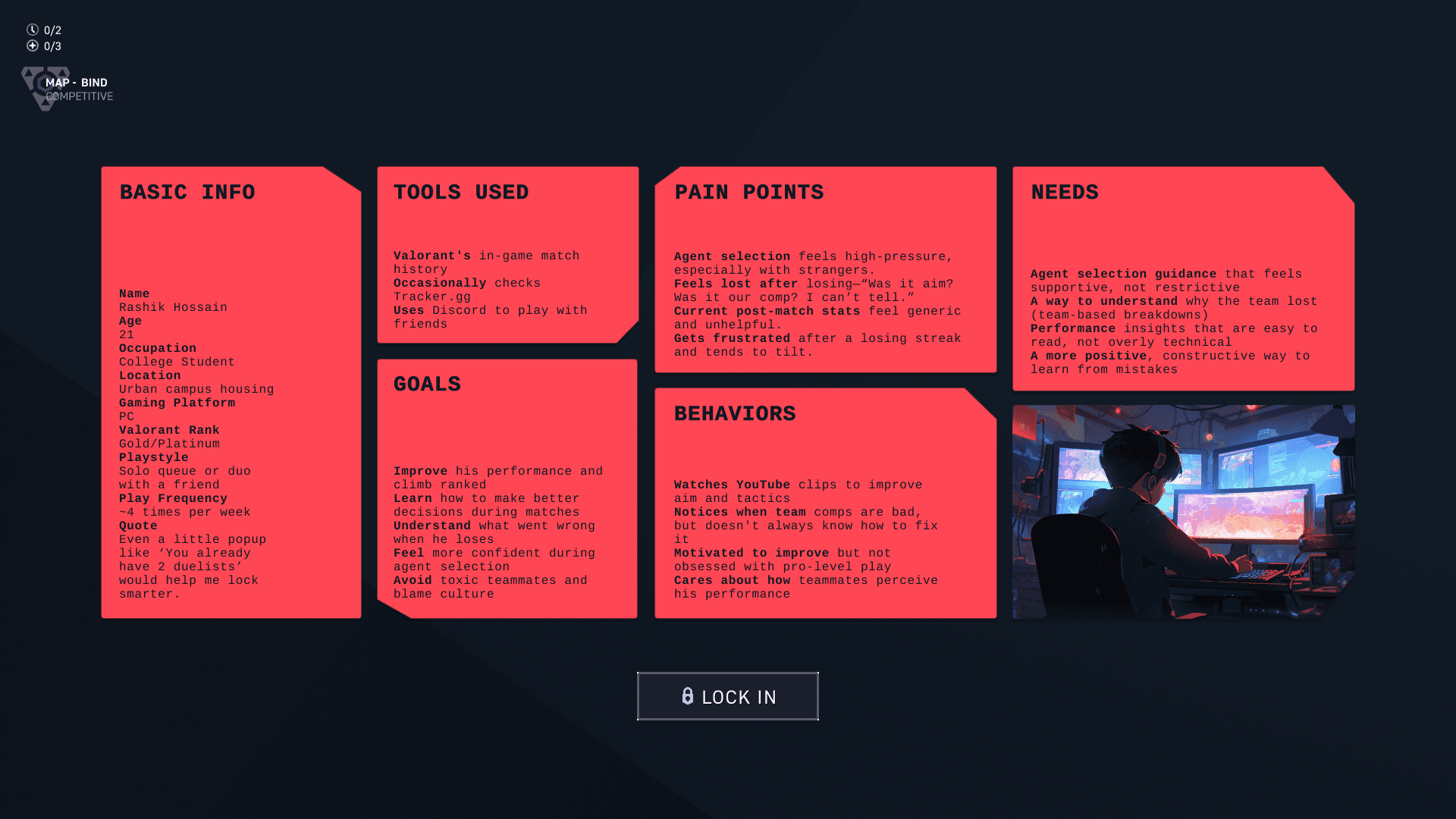
Rashik validated several core design directions. Here’s how:
✅ He confirmed players often leave matches unsure of what went wrong
✅ He highlighted the emotional pressure around agent select
✅ His hesitation inspired Mend’s subtle, smart team comp preview
✅ His preference for constructive over critical feedback shaped the tone of the app
Rashik reminded me that confidence grows when insights feel personal not punitive. He didn’t need more numbers. He needed meaning.
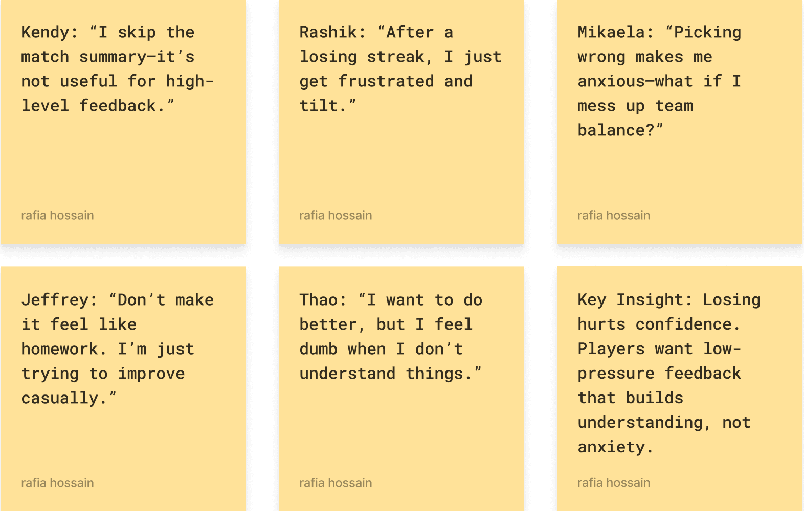
The Quiet Struggle to Improve
From my user interviews, three key themes emerged around emotional friction in competitive gaming. Rashik’s experience reflected all three.
First was the frustration of unclear feedback. After a tough match, Rashik often checked his stats, felt confused, and closed the game without real closure. The numbers didn’t help him understand why his team lost or what he could do differently.
Second was silence. Rashik described feeling anxious during agent select, especially in solo queue. Without knowing what the team needed, he hesitated. He didn’t want to make the “wrong” pick and get flamed, so he often stayed quiet and let others decide. This silence led to awkward comps and miscommunication before the match even began.
Finally, Rashik’s effort to improve like watching videos, tracking trends, and reflecting, often went unrecognized. He didn’t want to be micromanaged or overloaded with data. He just wanted lightweight, supportive feedback to help him grow.
2
Define
Key insights FROM USER RESEARCH
✦ Insight Paralysis
“I usually check my combat score, then close the game.”
↪ Players felt discouraged or confused by post-match stats that lacked context or actionable feedback.
✦ Unseen Contributions
“I want to know how I helped the team, not just how many kills I got.”
↪ Supportive actions like healing, utility use, or trades were invisible in post-match summaries, leaving non-fraggers feeling undervalued.
✦ Blame Without Clarity
“Would be great to show friends I’m not trolling.”
↪ Players often received blame after losses but lacked the tools to understand or explain what really went wrong.
methodology
I conducted five in-depth interviews with active Valorant players across a range of skill levels and playstyles. The participants included a professional esports competitor, a support-oriented registered nurse, a college student aiming to improve their rank, a casual solo player, and a social player who primarily queues with friends. This mix ensured perspectives from both competitive and casual contexts, solo and team-based play, and varying degrees of confidence and familiarity with post-match data. The interviews focused on players’ experiences with performance feedback, agent selection, and their ability to understand and learn from team losses.
research goals
I set out to understand what players need in order to grow, and what’s missing from Valorant’s current UX.
I focused on three core questions:
(1) What causes frustration or confusion after matches?
(2) Why do players ignore or misunderstand existing stats?
(3) What would actually help them reflect and improve?

1
Research
TABLE OF CONTENTS
1
4
2
5
3
6
Research
Design
Define
Final
Ideate
Reflection
MY ROLE
As the solo UX designer and researcher, I led every stage of the project:
Competitive research and feature benchmarking
Player interviews and insight synthesis
UX pain point definition and persona creation
Ideation, flow mapping, and feature prioritization
Wireframes and prototyping
UI design based on Valorant’s visual language
UX writing and microcopy
THE PROBLEM
Valorant offers little to no guidance on team synergy or post-match reflection. While the competitive scene thrives on analysis, most players are left guessing why they won or lost. There's no in-game support for understanding patterns, agent fit, or collaborative roles.
What I set out to solve:
Lack of contextual performance feedback after matches
Confusing or rushed agent selection with no synergy cues
A disconnect between personal growth and team strategy
THE OUTCOME
I designed two features that help players grow from each match. The first is a Performance Review Dashboard that breaks down individual stats like utility usage and kill-death patterns in a way that’s visual, role-aware, and easy to understand. The second is a “Why Did We Lose?” Summary that highlights key team-level breakdowns, such as low trade rates or failed site executions, so players can focus on improving rather than pointing fingers.
Context
Valorant UX+ was born from a recurring frustration I heard from players at all levels: they wanted to improve, but the game wasn’t helping them understand how. Whether it was a failed site take or a confusing post-match screen, the message was the same: “I don’t know what I did wrong.”
I’ve been there myself...queuing solo, getting flamed after a loss, staring at a row of numbers that meant nothing. While Valorant’s gameplay is polished and competitive, the user experience around it often leaves players without the tools they need to grow.
So I asked: what if post-match UX helped players reflect and get better without feeling blamed?
Point Of View (POV): I approached this project from the perspective of a solo queue player who wants to improve but often ends up confused or discouraged by the systems around them.
How Might We (HMW):
How might we help Valorant players understand their impact, identify team-based insights, and make more confident agent selections—without interrupting flow?
Role
UX/UI Designer & UX Researcher
duration
4 weeks
Tools
Figma, FigJam, Google Forms,
Notion
valorant
Elevating player focus through seamless UI
case study · 7 min read