
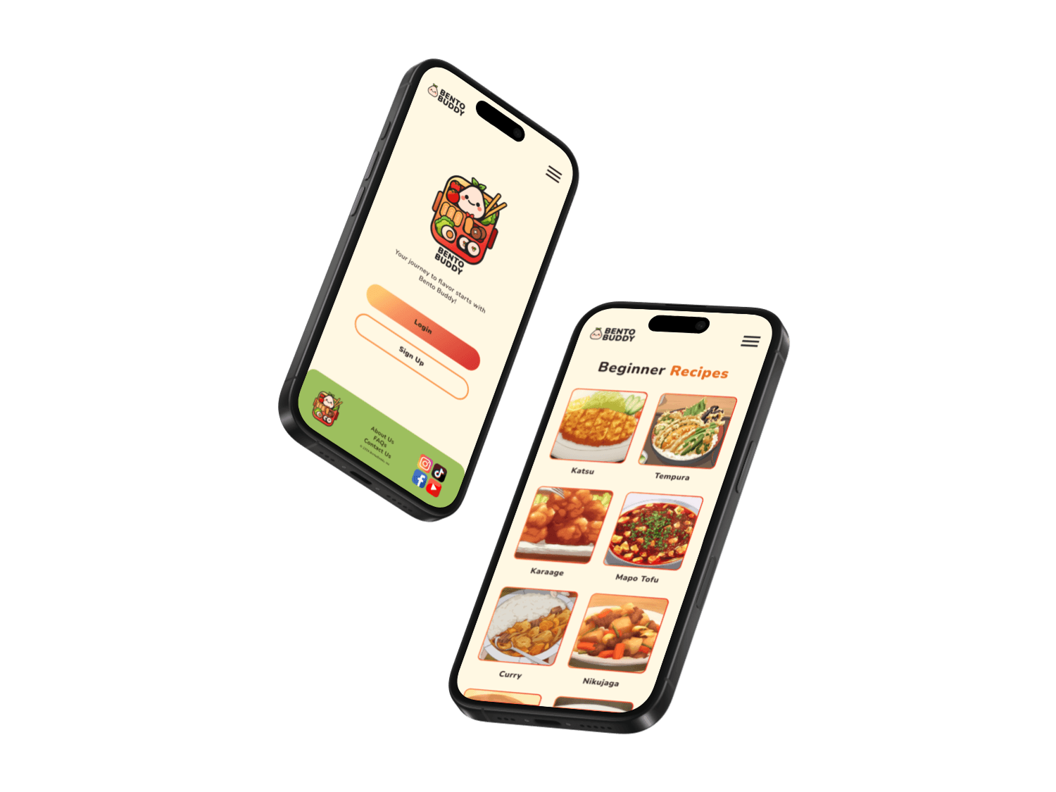
View Bento
Buddy
✦
Thank you for reading!
Want to talk about MEND or other projects?
You can find my contact information here.
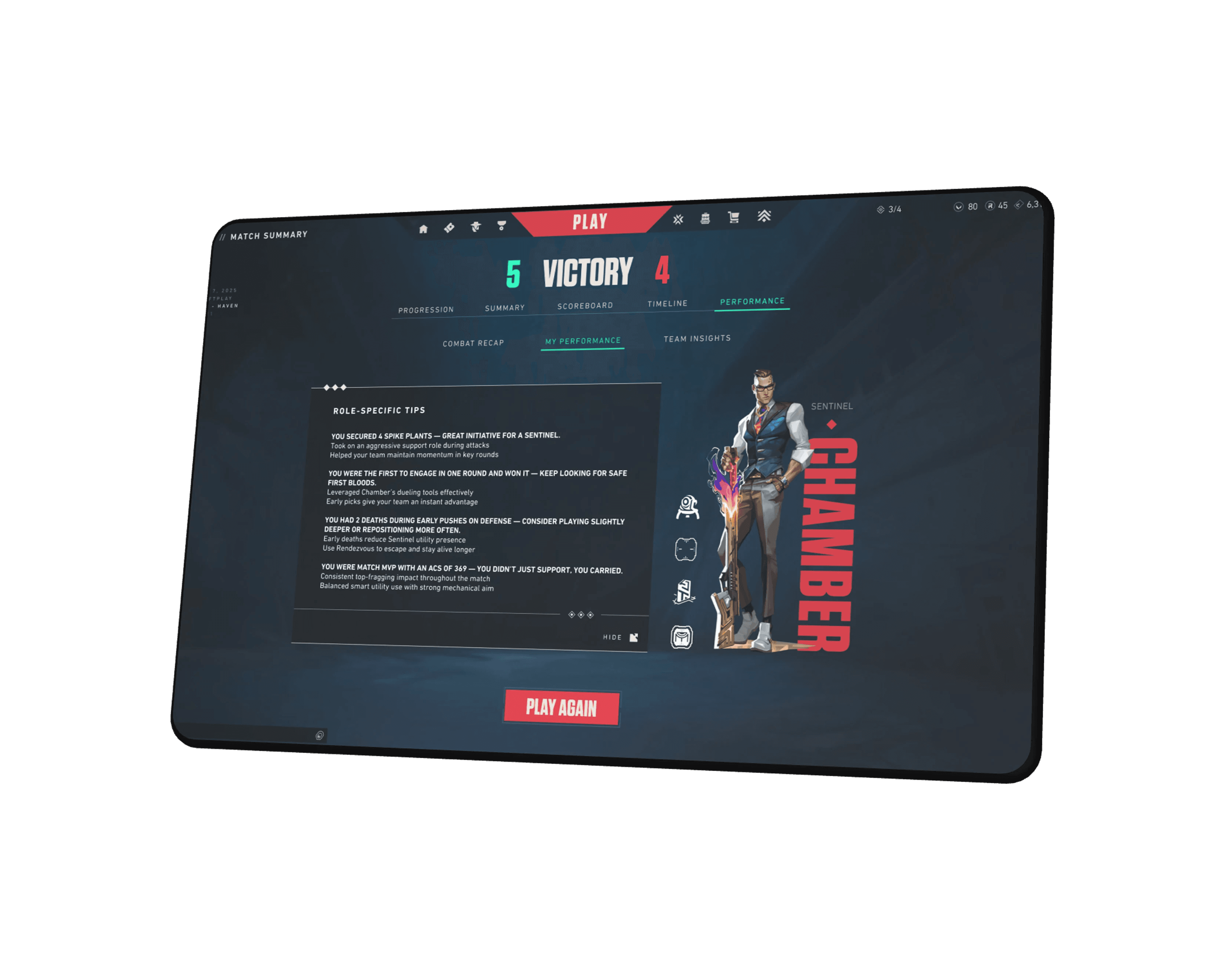
View Valorant
UX+
what's next?
Add a voice journaling feature.
Experiment with AI-curated mood prompts.
Extend tool options for different times of day.
Explore biometric integrations (with total user control).
what i learned?
Simplicity builds trust, especially in emotionally charged contexts.
Emotional UX is not about delight, but about reducing demands.
Language is design: a kind prompt can mean more than a feature.
This project shifted my thinking from “how to make something work” to “how to make someone feel okay in a space.”
6
Reflection
From low-fidelity clarity to a polished, emotionally aware experience
After creating my low-fidelity wireframes, I conducted an initial round of user testing to validate the core layout and content flow. Feedback confirmed that users appreciated the simplicity, but wanted more emotional warmth and clearer micro-interactions.
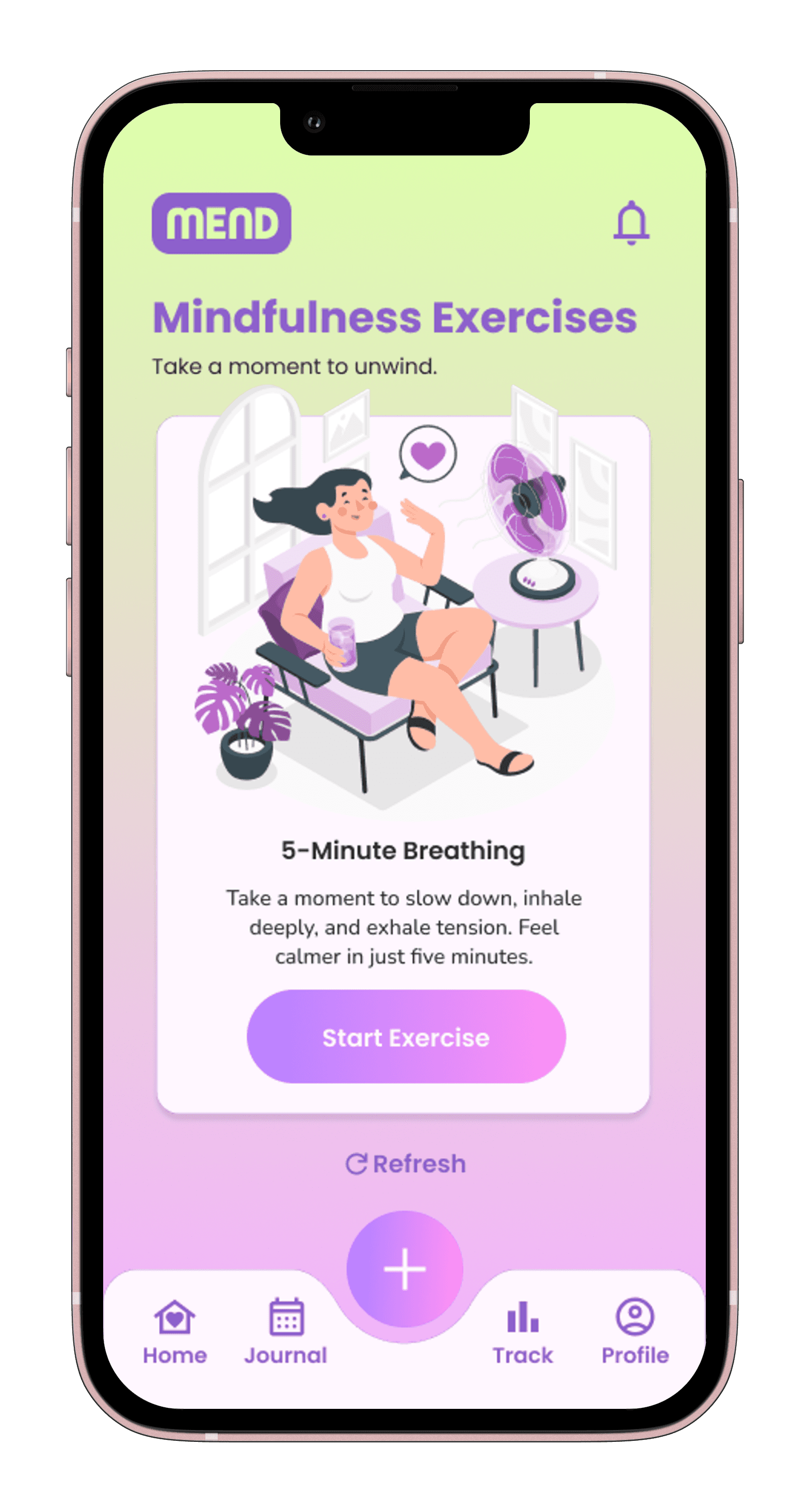
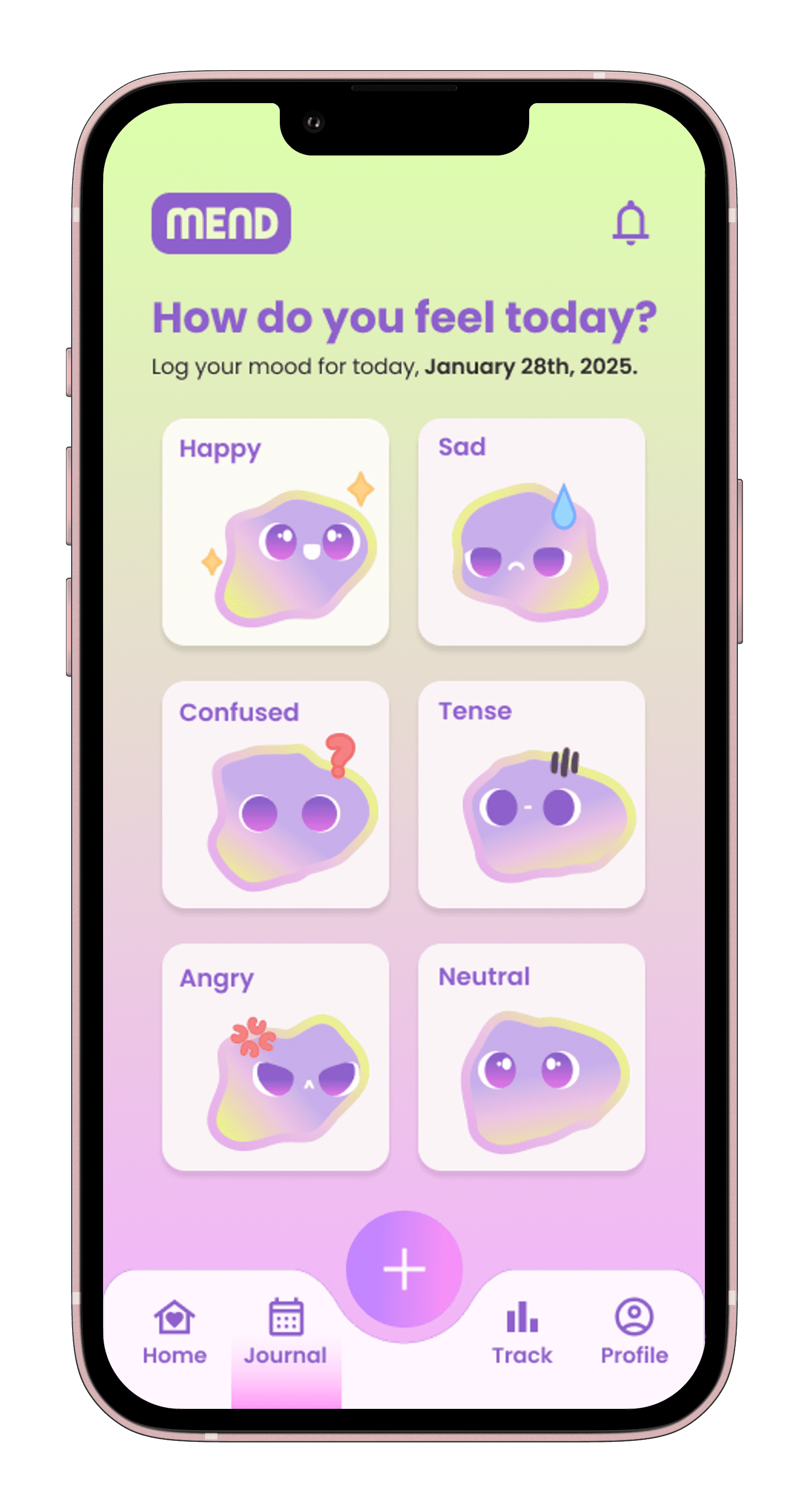
I then moved into high-fidelity wireframing, introducing Mend’s full visual identity soft gradients, glowy UI elements, and rounded typography to match the calm, supportive tone of the app. This version emphasized accessibility, mood-responsiveness, and ease of use, especially for users dealing with low energy or burnout.
Following a round of usability testing with the high-fidelity prototype, I identified areas for improvement such as button visibility, text readability in darker themes, and the clarity of the mood selection flow. Based on this feedback, I made key iterations to spacing, color contrast, icon labels, and transitions. You can view the full usability test plan and results here.
The result is a final prototype that feels lightweight yet emotionally grounded a tool that supports mental health without demanding extra energy from the user. Mend now delivers quick relief, clear mood tracking, and schedule-friendly self-care with a warm and approachable UI.
5
Final
Structuring the experience around emotional ease
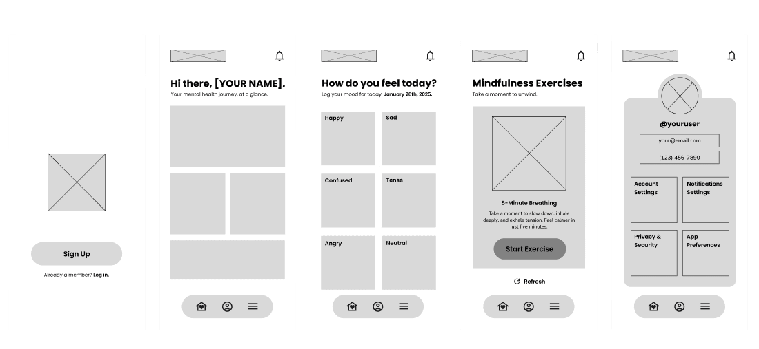
These low-fidelity wireframes map out Mend’s foundational flow from onboarding to mood tracking to personalized self-care. The layout prioritizes clarity and emotional simplicity, using minimal elements to reduce cognitive load. Each screen supports a specific use case:
• Onboarding welcomes users with a soft start and clear CTA
• Homepage provides a snapshot of the user’s emotional journey
• Mood Check-In allows for fast, emotion-based logging
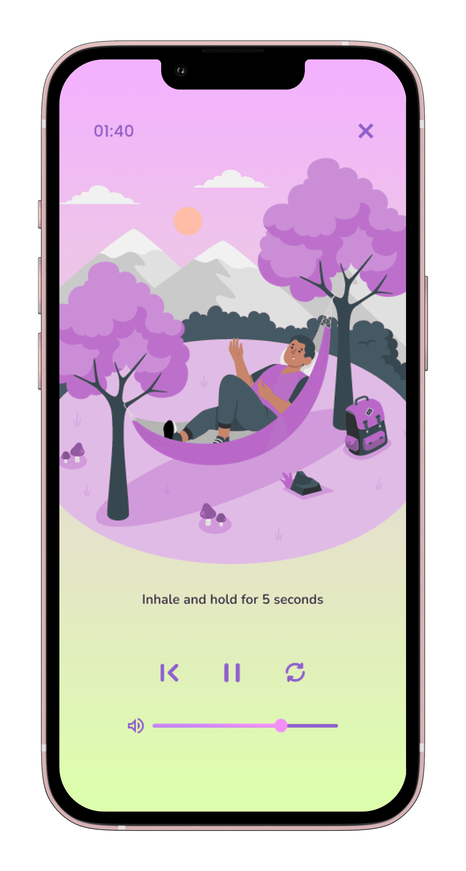
• Mindfulness Portal surfaces quick, relevant exercises like 5-minute breathing
• Profile Settings keep user preferences easily accessible without clutter
This low-fidelity stage helped validate content hierarchy, interaction points, and the emotional pacing of the app ensuring every step felt light, intuitive, and centered on support.
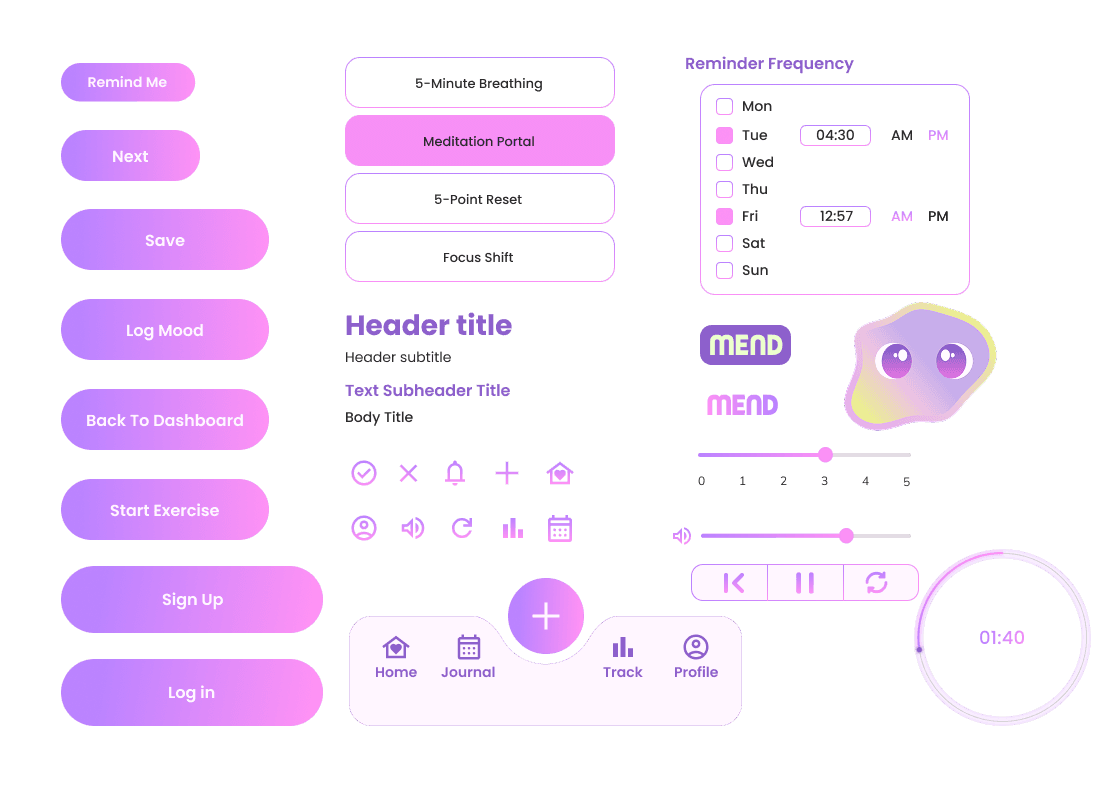
UI COMponents
Simple actions, glowy gradients, and soft touchpoints
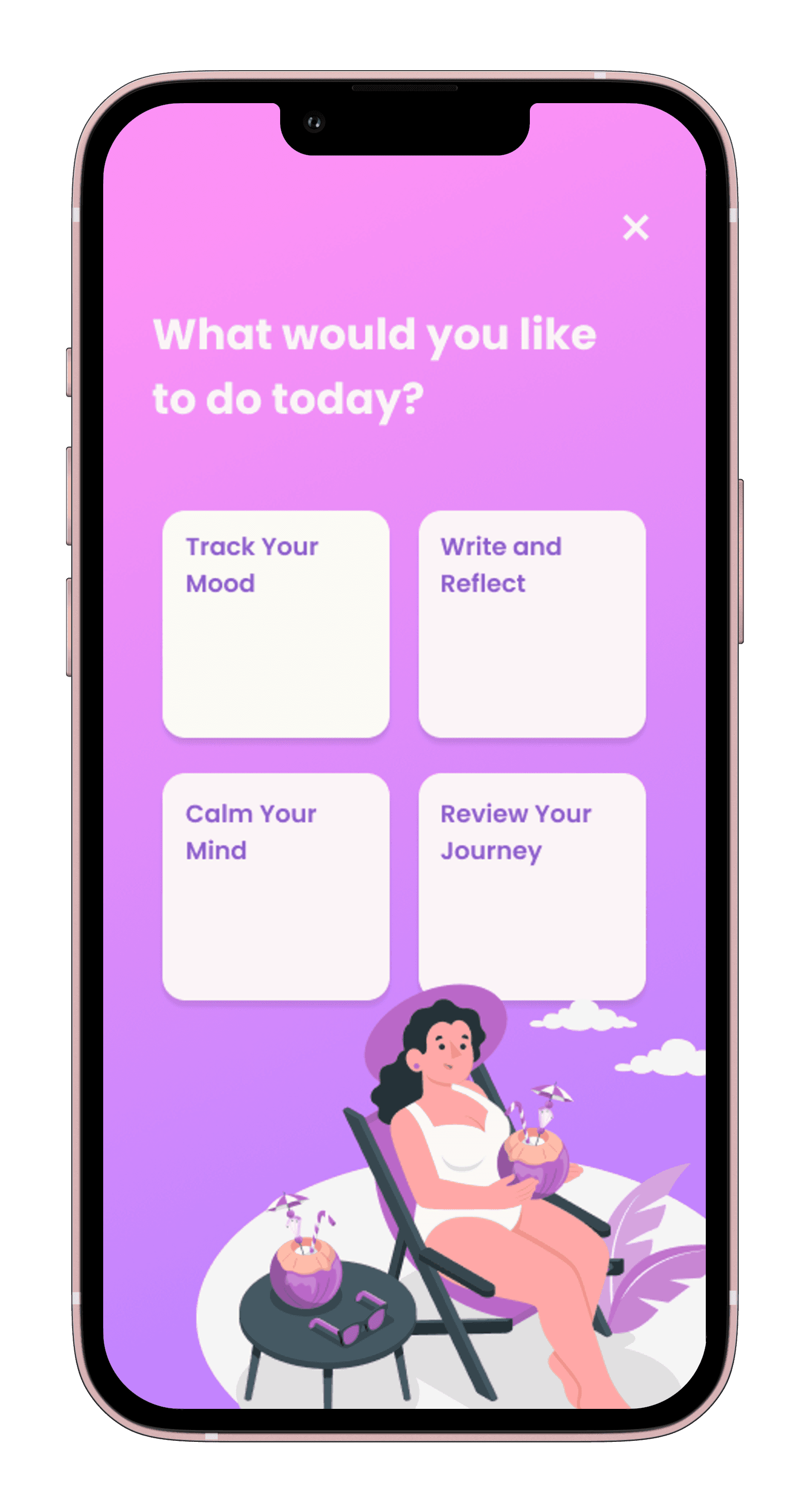
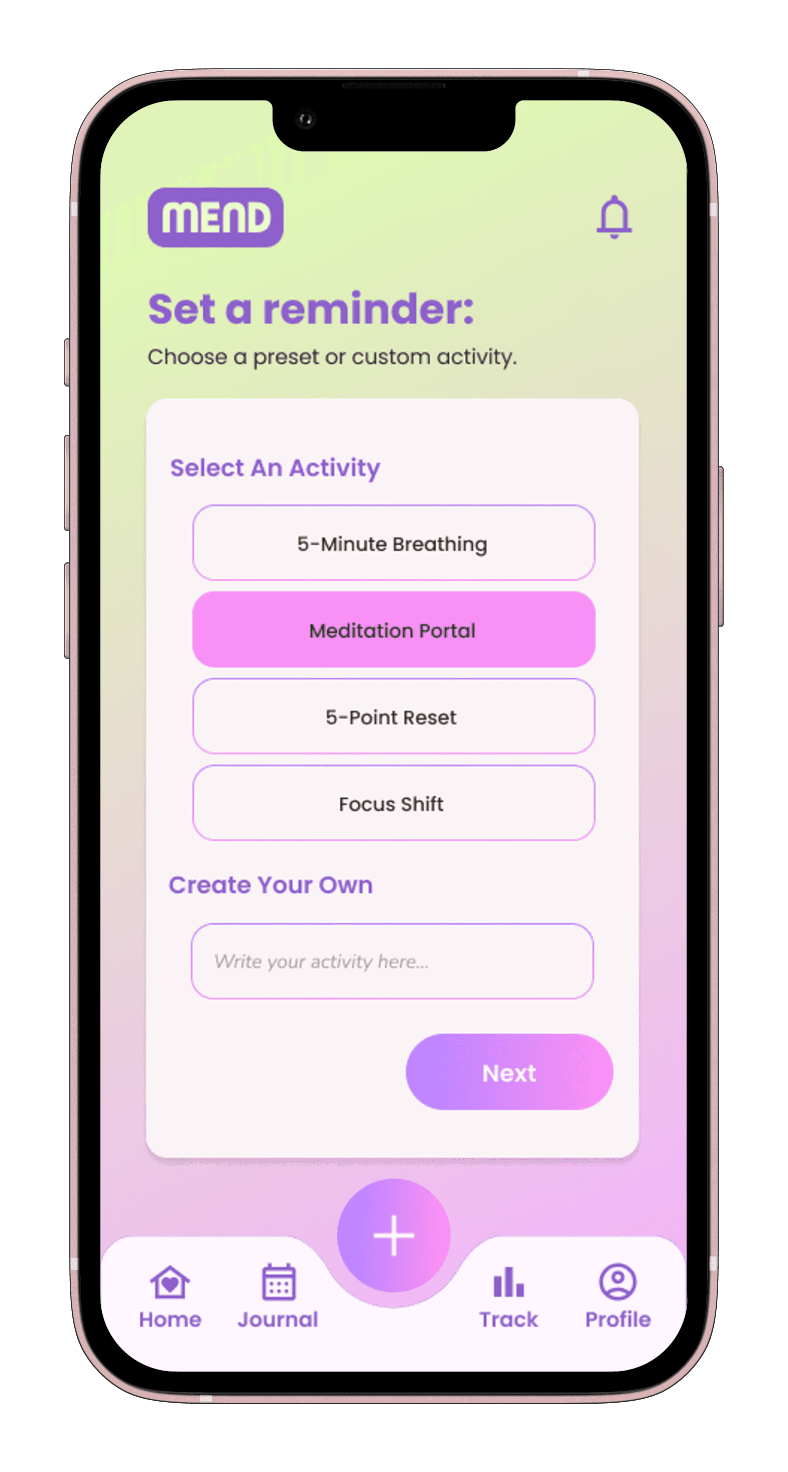
Mend’s UI kit uses pill-shaped buttons, rounded icons, and soft neon gradients to keep every interaction feeling light and easy. The typography is readable and minimal, while colors shift subtly to reflect mood and energy. Components like the reminder scheduler, mood slider, and journal tab bar were built to prioritize clarity and emotional tone, helping users navigate without overwhelm. This kit makes self-care feel friendly, flexible, and low-pressure just like the users asked for.
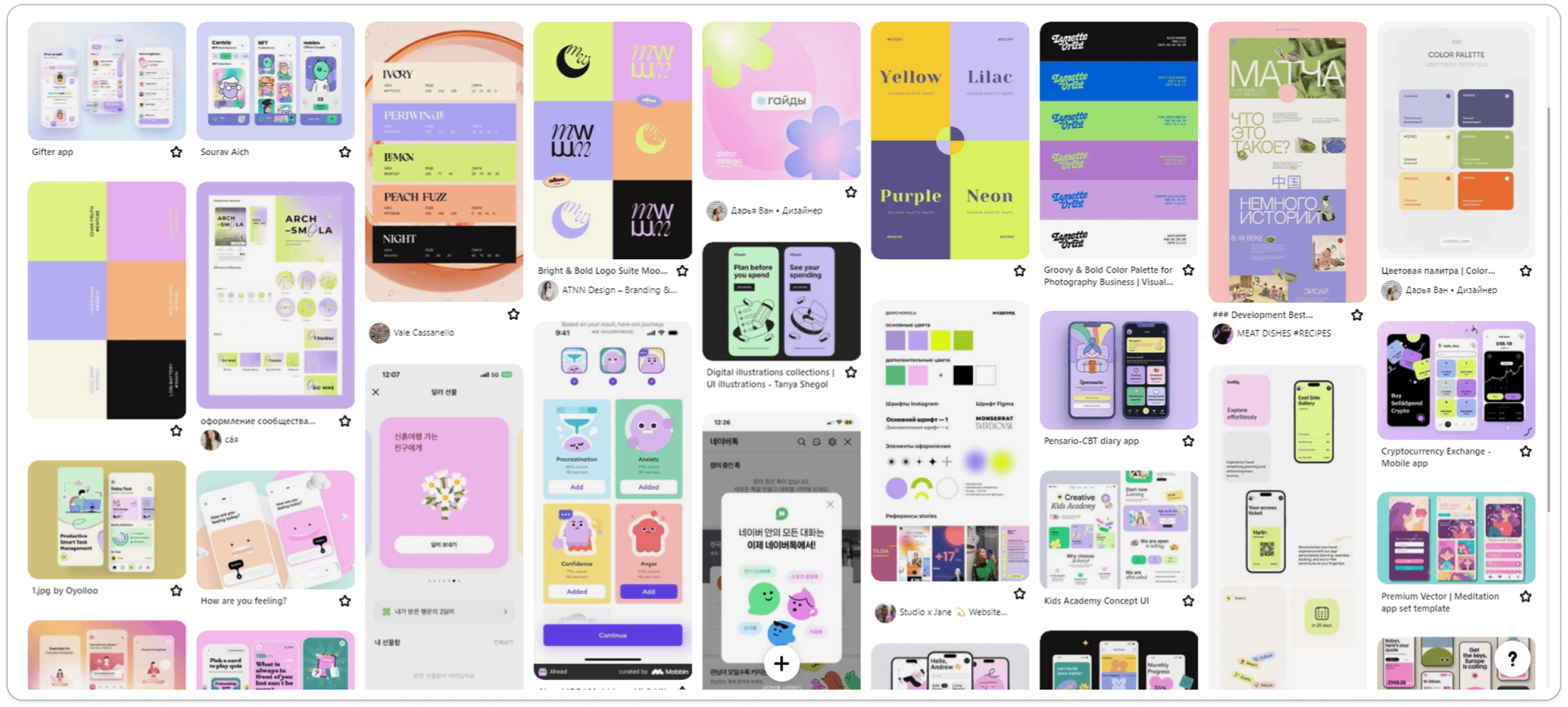
moodboard
Soft boldness, emotional color, and playful calm
This moodboard explores a mix of pastel gradients, rounded typography, and expressive illustrations. I chose this style to reflect Mend’s tone gentle yet emotionally present. The use of purples, pinks, and neons balances calmness with vibrancy, creating a visual language that feels comforting, modern, and slightly playful without being childish. This sets the stage for a wellness tool that feels approachable even in vulnerable moments.
4
Design

I then created (2) User Flows to visualize how someone like Mikaela would move through key actions in the app. One flow focused on tracking mood based on emotional state, while the other showed how to set up self-care reminders that respect personal schedules. These flows helped shape a user experience that feels simple, non-intrusive, and emotionally aware.
Affinity mapping
Organizing emotional insights into actionable structure
To bridge the gap between research and design, I began organizing user pain points and desires into a clear foundation for Mend’s features.
I started with an Affinity Map to cluster insights from interviews into themes like burnout, energy levels, emotional regulation, and flexible timing. This helped me identify which features would offer meaningful support without adding pressure.
3
Ideate
✦
Design Goals
Create a no-pressure check-in flow.
Prioritize warmth, not productivity.
Offer gentle tool suggestions, not diagnoses.
Make everything optional: no tracking, no “daily streaks,” no guilt.
Help users feel seen without being studied.
problem statement
Emotionally overloaded users need a way to acknowledge how they feel that’s quick, optional, and emotionally safe without requiring vulnerability or mental effort.
How does This persona Support Mend?
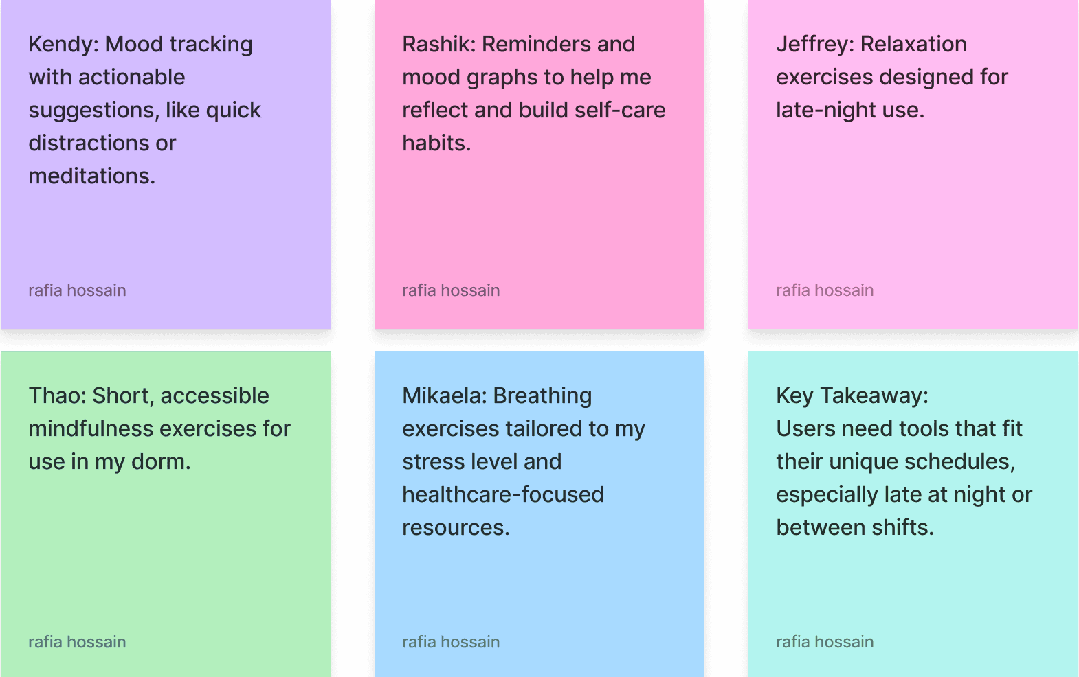
Mikaela’s persona grounded my design choices in empathy and realism. It pushed me to prioritize mood-based interactions, short, on-demand activities, and flexible journaling over rigid daily routines or social features. Her pain points directly shaped Mend’s focus on low-pressure, emotionally responsive support making the app feel like a tool for relief, not another task to complete.

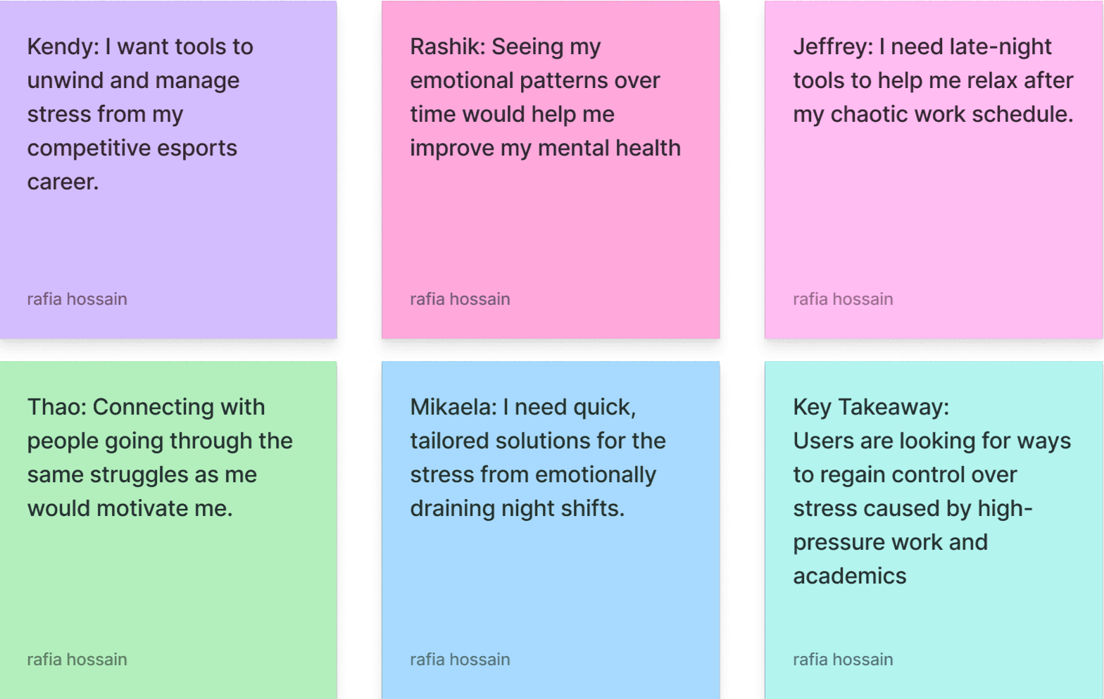
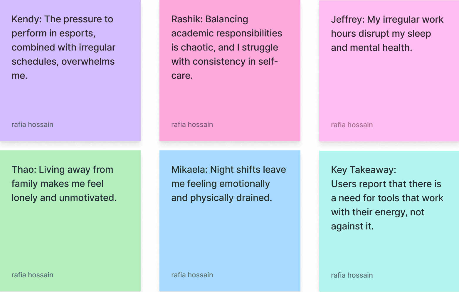
Burnout, boundaries, and emotional reset
From my user interviews, three key themes emerged around emotional exhaustion and time constraints. Many participants, especially those in caregiving or shift-based roles, described running on autopilot after work. They were often too drained to engage with traditional wellness routines that required high energy or consistent time commitment.
Participants also expressed a need for emotional tools that matched how they were feeling in the moment. Rather than rigid daily check-ins, they preferred short, flexible activities that could be adjusted to their mood and availability.
Lastly, timing and boundaries played a major role. People wanted self-care experiences that respected their off-hours: something they could access on their own terms, without pressure or notifications.
2
Define
Key insights FROM USER RESEARCH
✦ Low Emotional Energy
“I can’t open another app that feels like homework.”
↪ People avoided apps that required too much cognitive or emotional effort especially during high-stress moments.
✦ Desire for Anonymity
“I just want to feel something without having to explain it.”
↪ Users didn’t want to talk to a chatbot or fill out long forms. They wanted emotional safety, not analytics.
✦ Optional Reflection
“Sometimes I want to come back to how I felt. Sometimes I don’t.”
↪ Users liked the idea of having a private log but on their own terms. They didn’t want guilt-based nudges or pressure to analyze feelings.
methodology
5 in-depth interviews
23 user survey responses
Diverse age range (19-32), backgrounds, emotional needs
Interviewees included:
a nurse, 2 students, an esports professional, and a bartender
Each session was semi-structured and focused on emotion-driven behaviors.
research goals
I wanted to understand what causes users to avoid or abandon wellness tools and what actually feels supportive when someone is overwhelmed.
So, I focused on three questions:
• What do people emotionally need when they’re in a low state?
• Why don’t they use mental health tools even when they want to feel better?
• What would emotional support look like if it required no performance?
1
Research
TABLE OF CONTENTS
1
4
2
5
3
6
Research
Design
Define
Final
Ideate
Reflection
MY ROLE
As the solo designer and researcher, I led every phase of the project:
User interviews and affinity mapping
Persona development
UX flows and journey mapping
Wireframing and prototyping
UI design and interaction states
Usability testing and iteration
Visual branding and accessibility
THE PROBLEM
Despite the growing popularity of mental health apps, many fall short in providing emotional support. Instead, they focus heavily on productivity and data tracking, which can come across as clinical, demanding, or even guilt-inducing.
Research shows that emotional exhaustion, grief, and burnout are some of the most common and isolating challenges people face. In those moments, even basic self-care can feel like pressure.
For this case study, I wondered: how might we design a mental health tool that feels gentle, human, and supportive, especially when energy is low?
THE OUTCOME
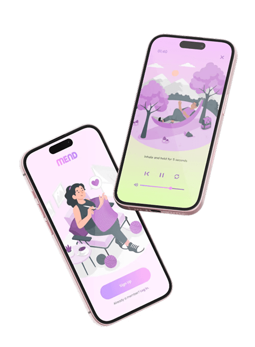
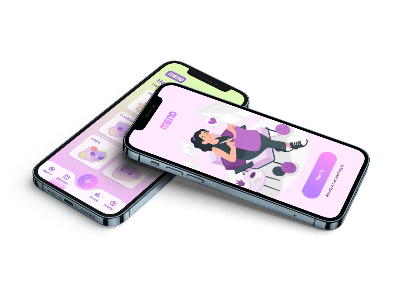
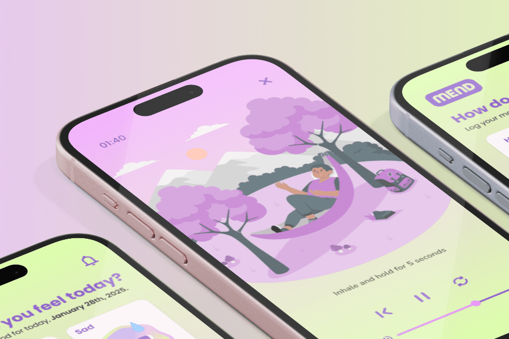
Mend is a soft, mobile-first mental wellness tool for users who are emotionally overloaded. It invites users to check in through gentle prompts and offers calming care suggestions based on their mood: without diagnosing, or demanding too much. Its entire UX is designed to evoke warmth, lightness, and relief.
Context
Mend was born out of a pattern I couldn’t ignore in myself, and in almost everyone I cared about. Friends, students, coworkers, even strangers online, they all said the same thing in different words:
“I’m so tired. I don’t even know how I feel anymore.”
At the time, I was juggling multiple jobs and caregiving responsibilities, feeling stretched and numb. I didn’t have the emotional capacity to open a meditation app, fill in a mood tracker, or maintain some sort of routine. I needed something small. Soothing. Barely interactive. So I designed MEND: an app that gently invites people to check in with themselves when they’re overwhelmed. There are no streaks. No charts. No tasks. Just space to feel and recover.
Role
UX/UI Designer & UX Researcher
duration
3 months
Tools
Figma, FigJam, Google Forms,
Notion
mend
a self-guided healing platform
case study · 7 min read