
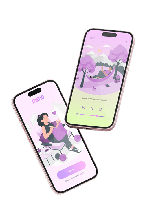
View MEND
✦
Thank you for reading!
Want to talk about Bento Buddy or other projects?
You can find my contact information here.
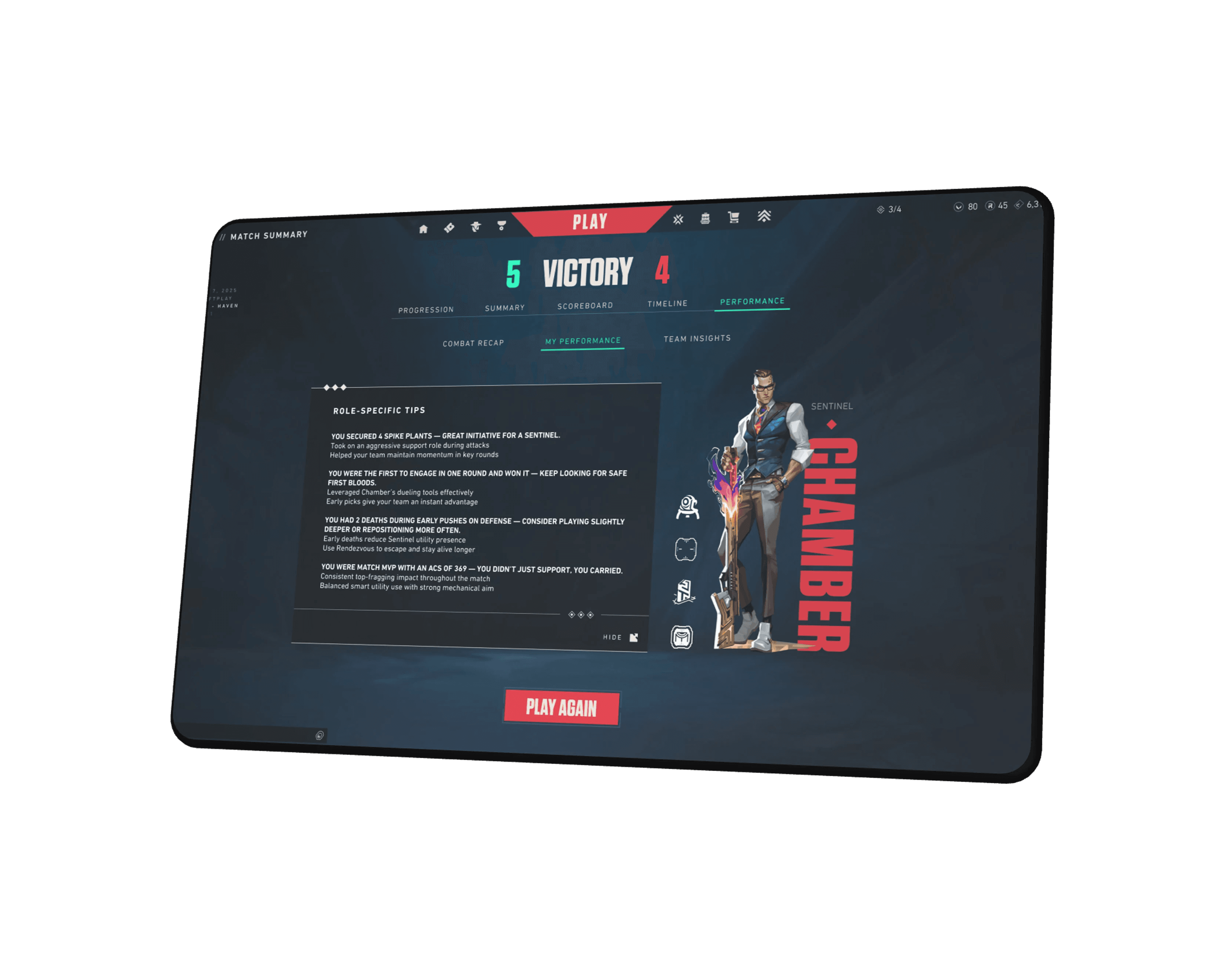
View Valorant
UX+
what's next?
Add video guided cooking tips to support different learning styles.
Incorporate personalized recipe suggestions based on skill level and mood.
Develop quick save options for users to bookmark favorite meals easily.
Explore ingredient delivery integration to streamline shopping and cooking.
what i learned?
Clear, straightforward design helps users feel confident and reduces frustration.
Great UX is not just about flashy features it is about making tasks feel effortless and enjoyable.
Every word matters friendly, encouraging language can make the experience more welcoming than any visual element.
This project taught me to prioritize the user’s emotional comfort alongside functionality.
6
Reflection

From low-fidelity clarity to a polished, engaging cooking experience
After completing the low-fidelity wireframes, I conducted initial user testing to validate the basic layout and navigation. Users appreciated the clean, simple structure but expressed a desire for more warmth and clearer interactive feedback.
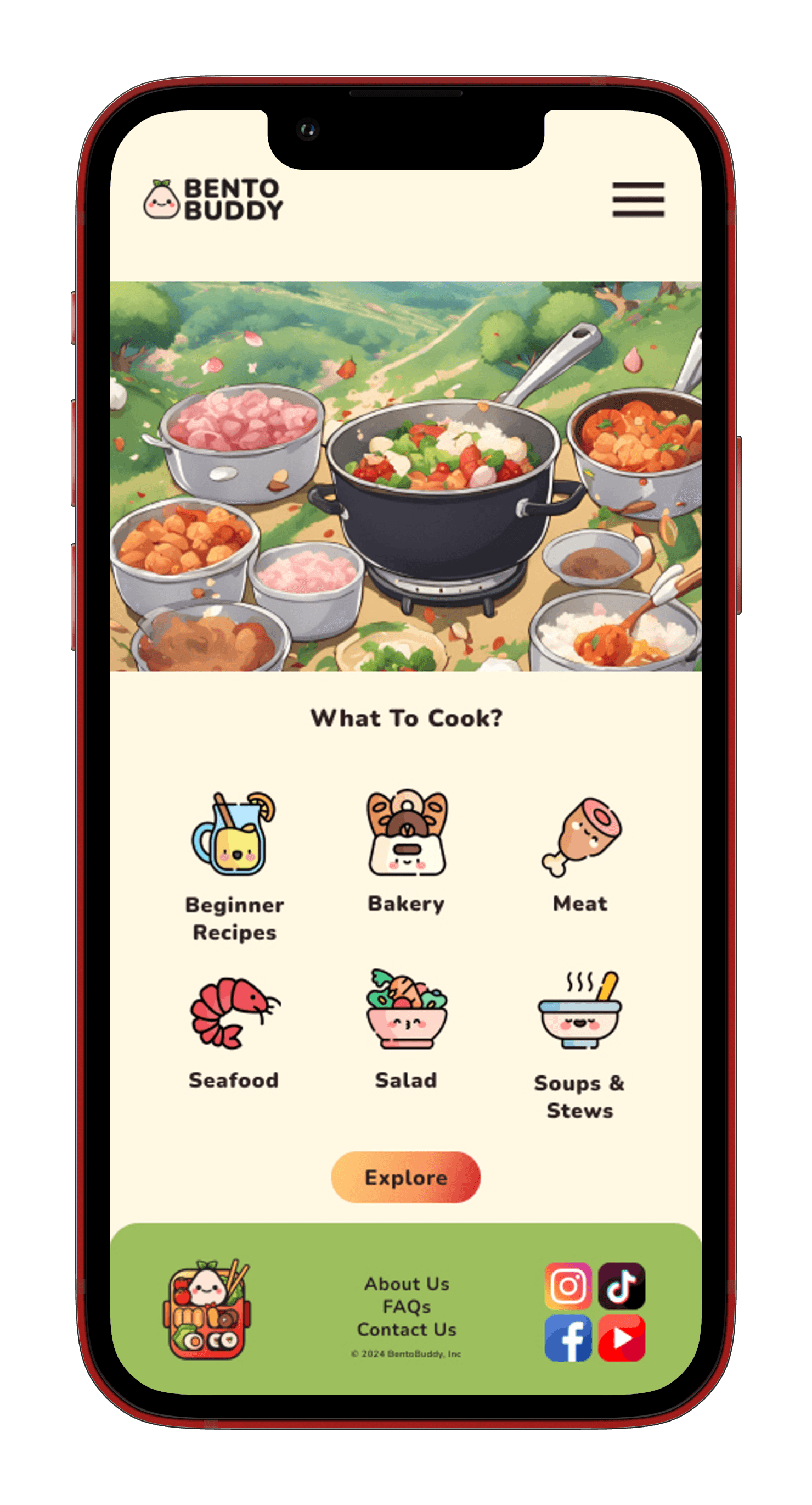
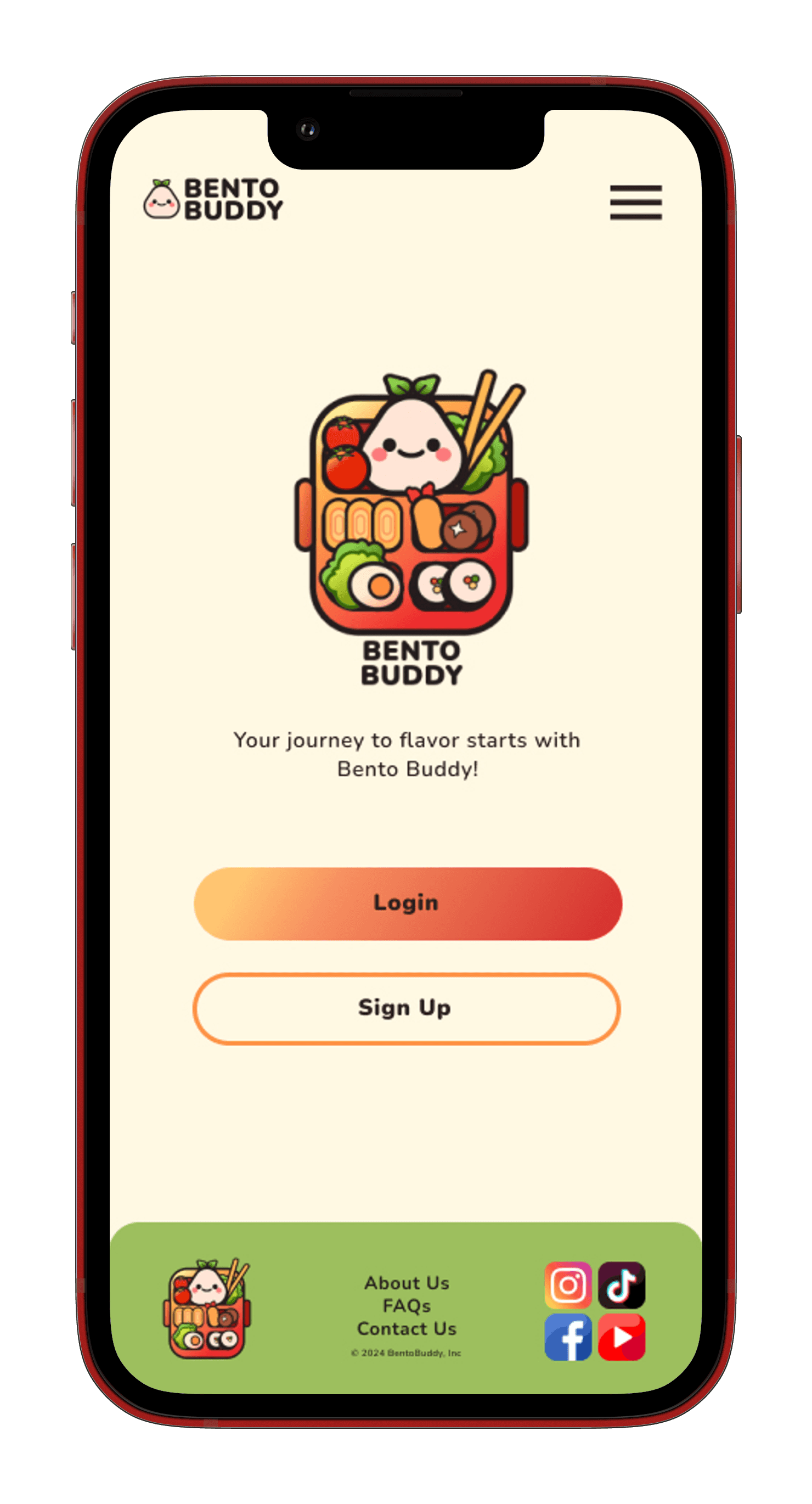
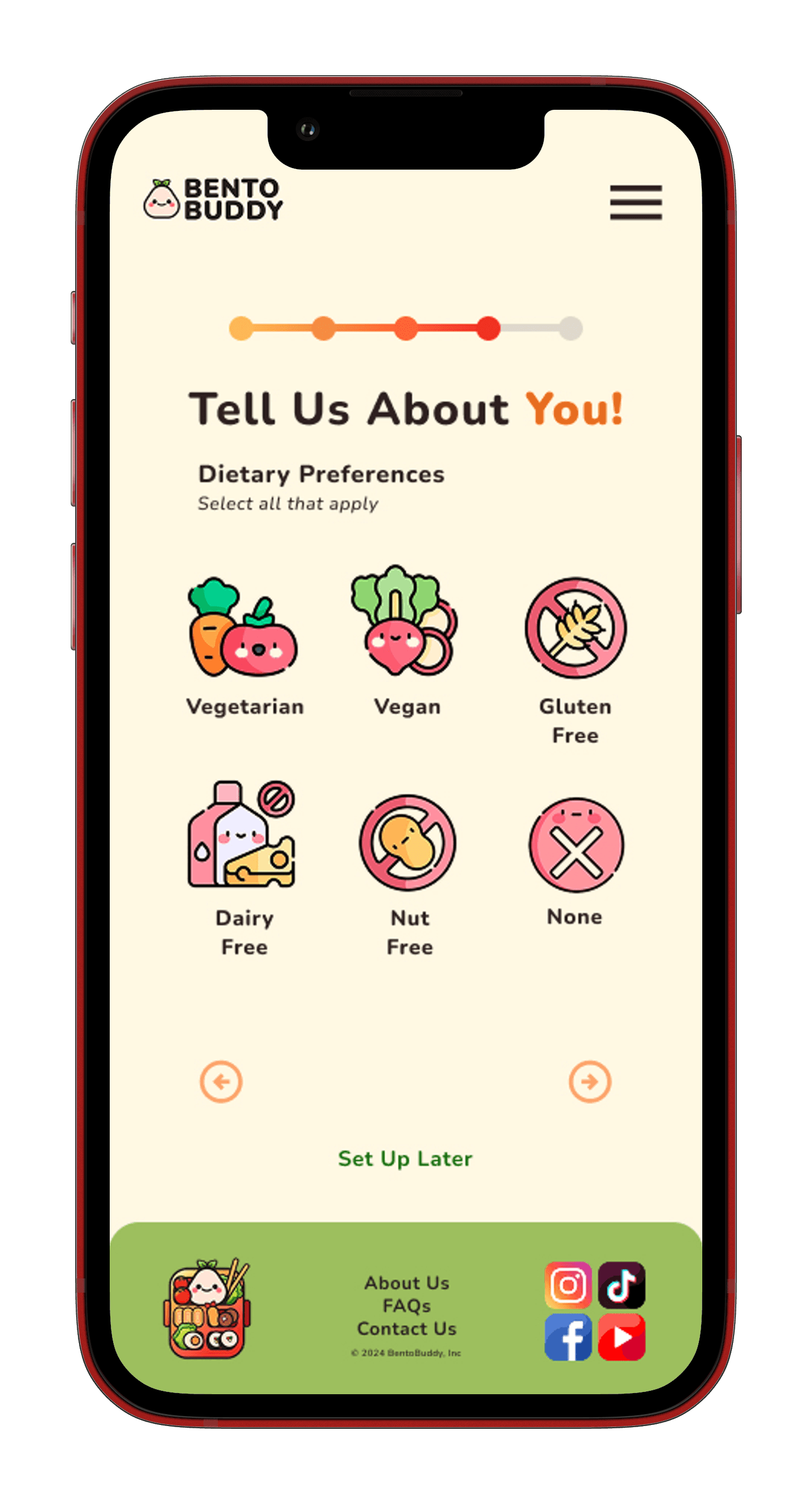
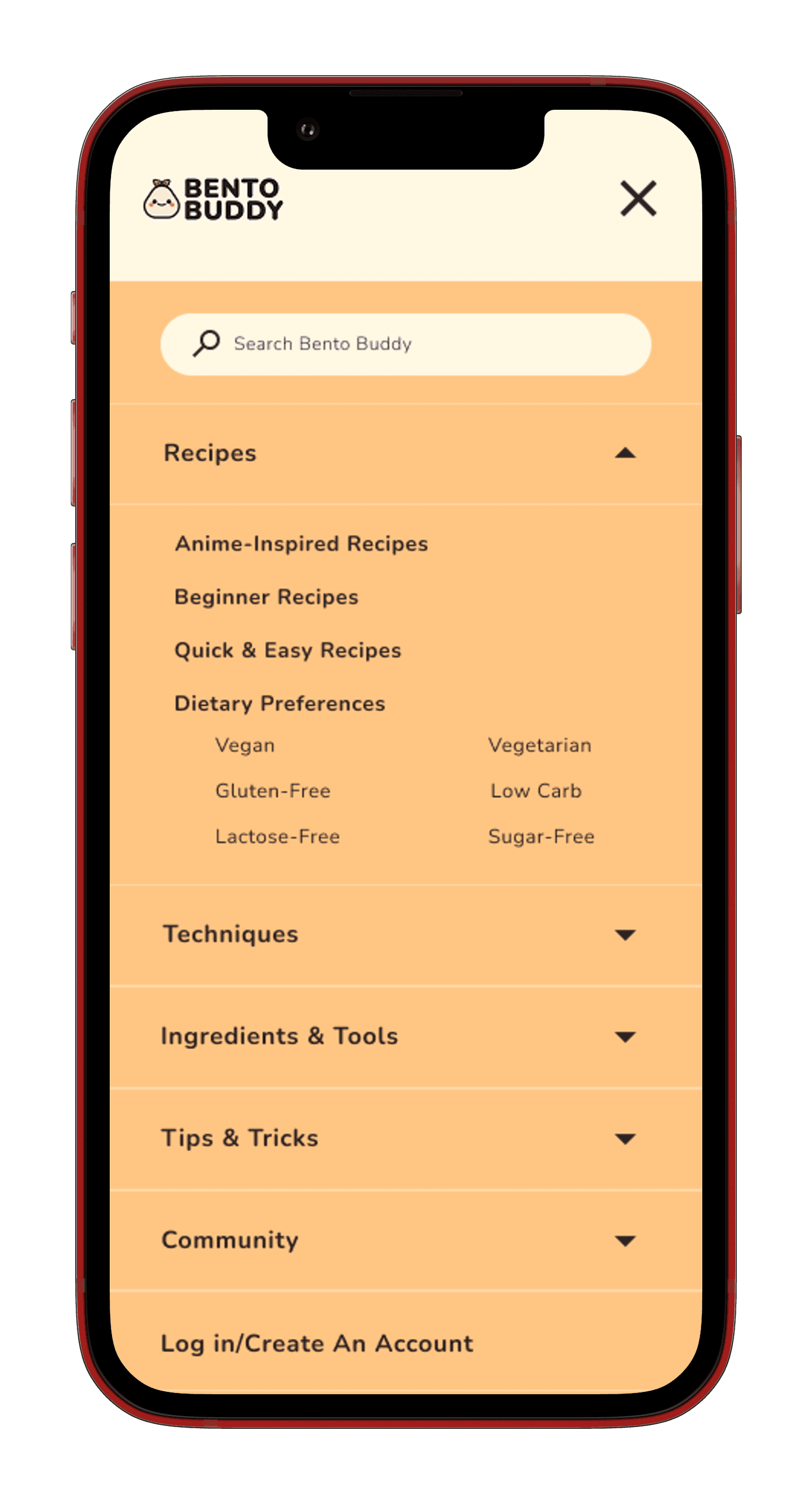
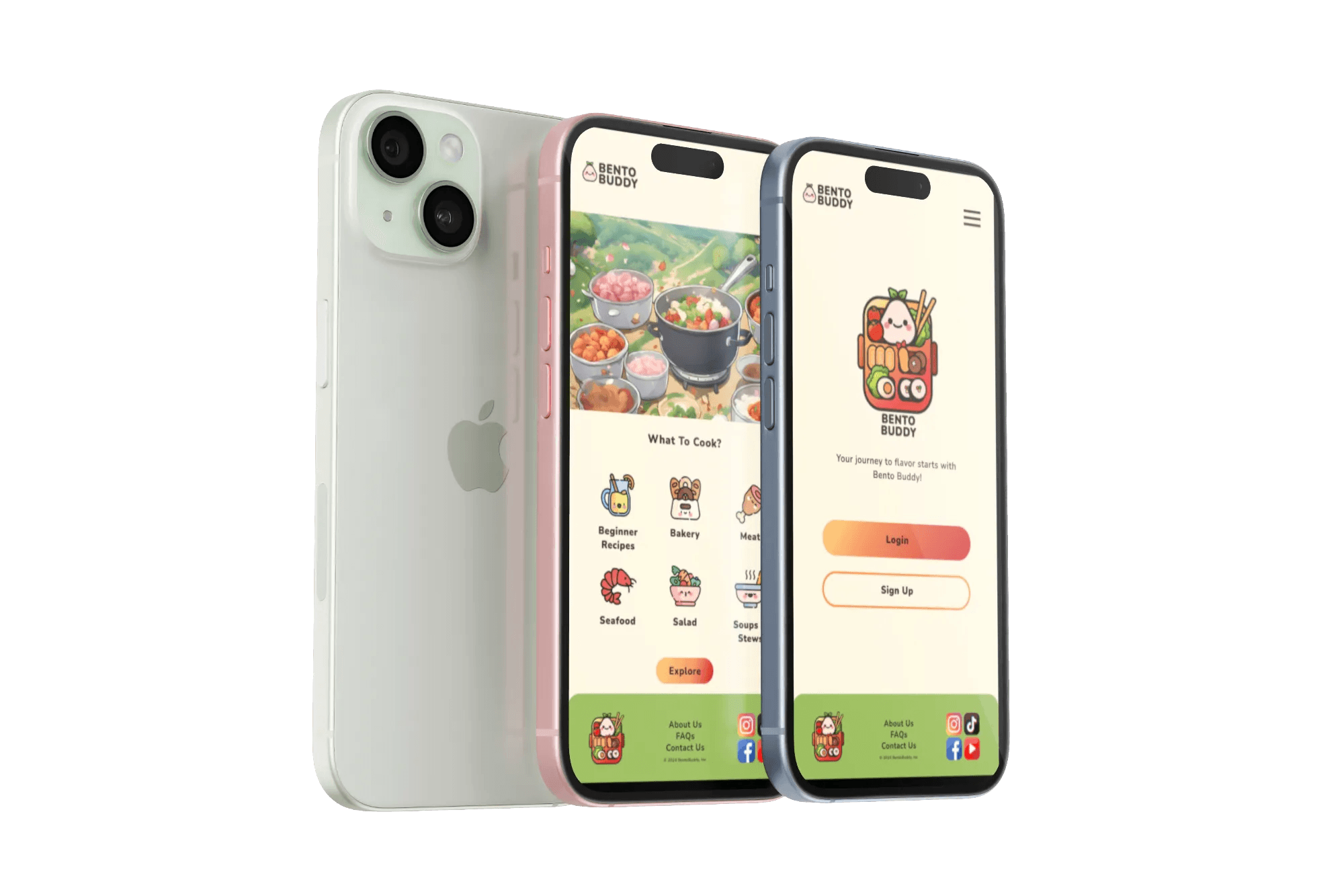
I then progressed to high-fidelity wireframing, bringing in Bento Buddy’s vibrant color palette of oranges, greens, and yellows alongside playful gradients and pill-shaped buttons. The use of Nunito font and friendly illustrations added personality while keeping the UI approachable and easy to scan.
Usability testing on the high-fidelity prototype revealed areas for improvement such as button prominence, color contrast for readability, and clearer progress indicators during recipe steps. Based on this feedback, I refined spacing, adjusted color balances, and enhanced micro-interactions for smoother, more intuitive user flow.
The final prototype delivers a joyful, low-pressure cooking experience that supports users’ skill levels and personal tastes, helping them bring anime-inspired meals to life with confidence and fun.
5
Final

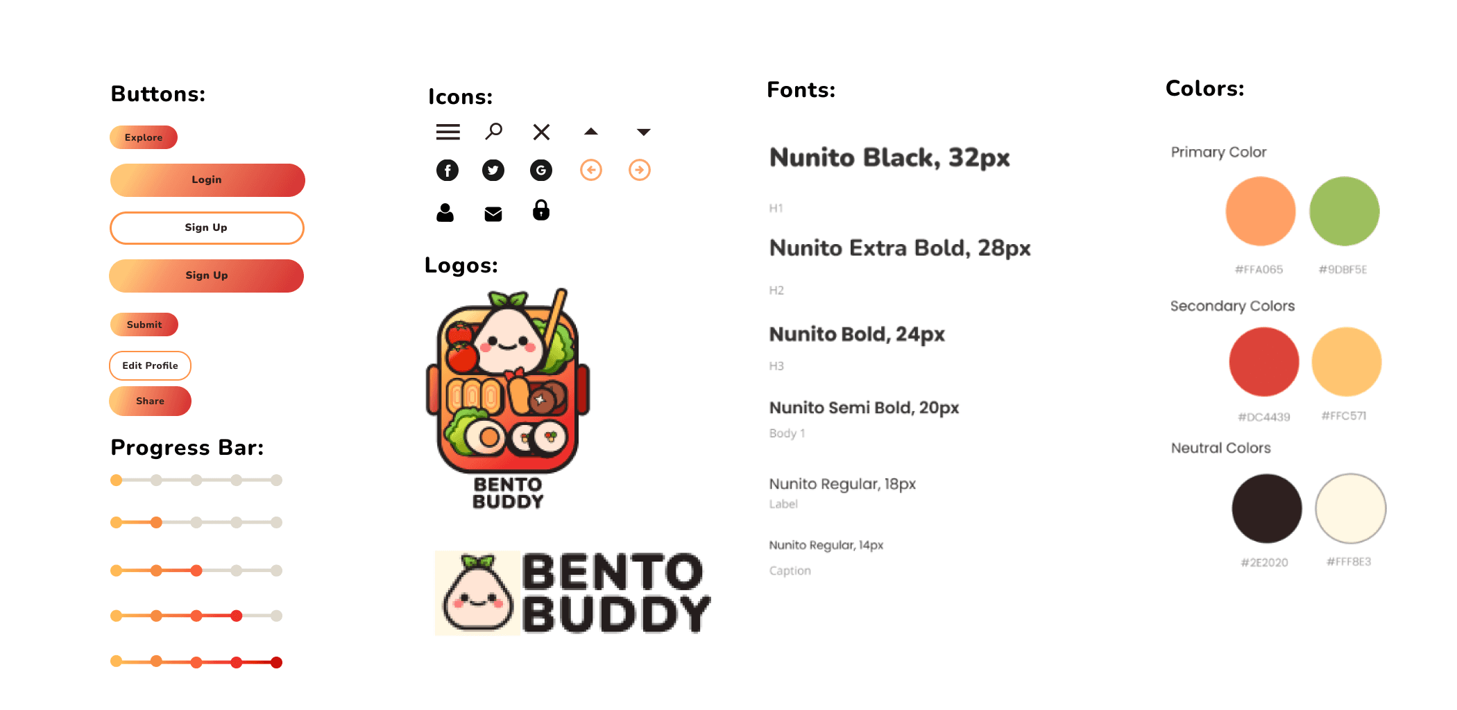
UI COMponents
Bento Buddy’s UI kit blends playful elements with a warm, inviting aesthetic. The logo features a simple bento box icon, instantly connecting to the app’s anime-inspired cooking theme.
Buttons are pill-shaped with smooth yellow, orange, and red gradients that evoke energy and appetite while remaining approachable. Progress bars follow this gradient style, extending horizontally to visually track cooking steps or goals.
Typography uses Nunito, a rounded and friendly sans-serif font that complements the pill-shaped buttons and soft visual style, reinforcing the app’s welcoming and easygoing personality.
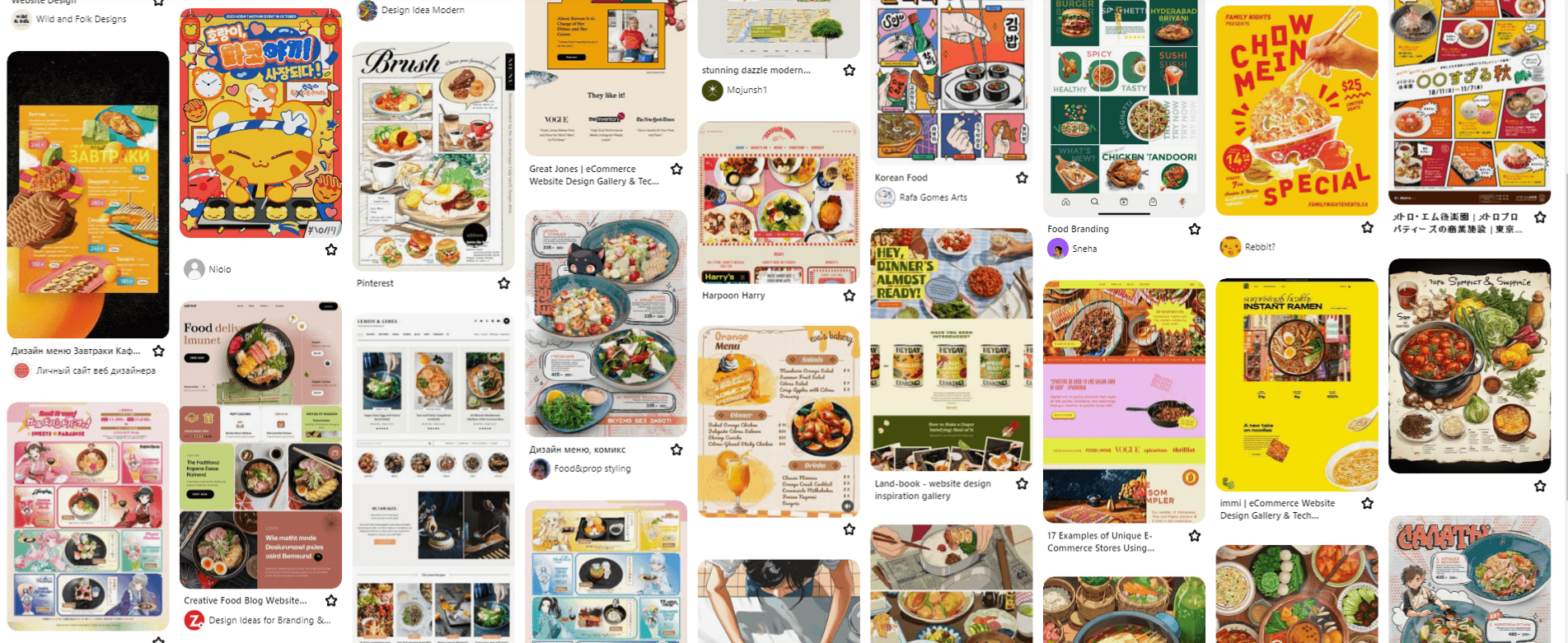
moodboard
Bright warmth, playful energy, and inviting freshness
This moodboard features a lively palette of oranges, greens, yellows, and other food-inspired colors. Rounded typography and friendly illustrations create a fun and approachable vibe. The combination of vibrant hues and soft shapes reflects Bento Buddy’s goal to make cooking feel joyful, creative, and stress-free. It sets a tone that is energetic and welcoming without being overwhelming, inviting users to explore anime-inspired recipes with confidence and delight.
4
Design
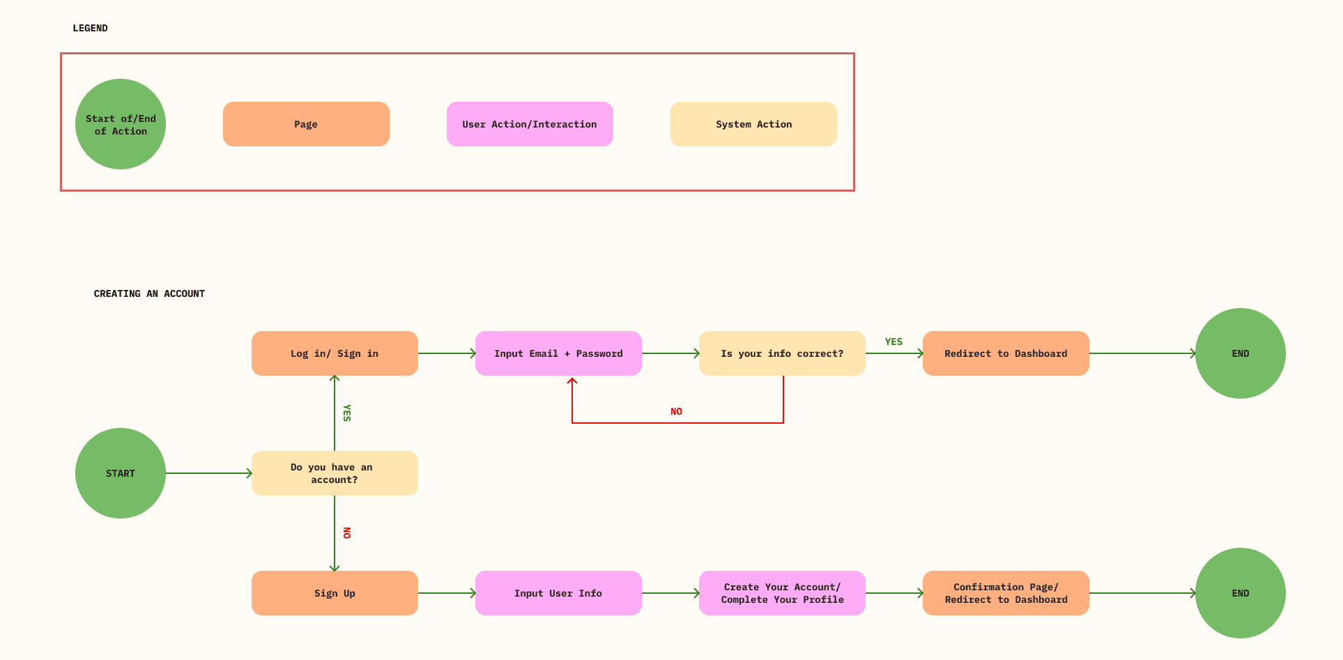
I then created (2) User Flows to visualize how a user might navigate Bento Buddy’s core experience. One flow focused on account creation, a simple and welcoming process to get users started quickly. The second flow explored community engagement features like sharing meals or tips. While this second idea helped me think through user motivation and retention, I wasn’t able to implement it due to time constraints. The flow still reflects future directions I hope to explore, even if it is not present in the current prototype.
Affinity mapping
Organizing user insights into actionable structure
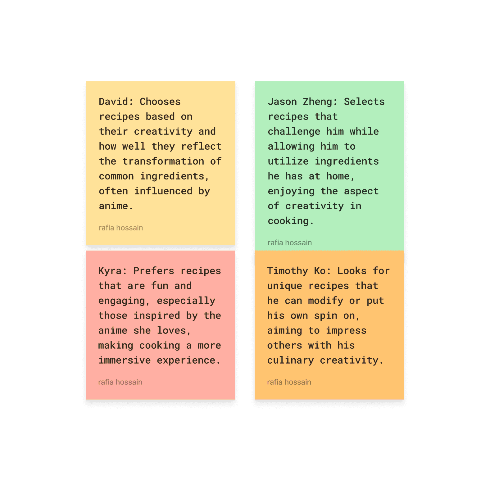
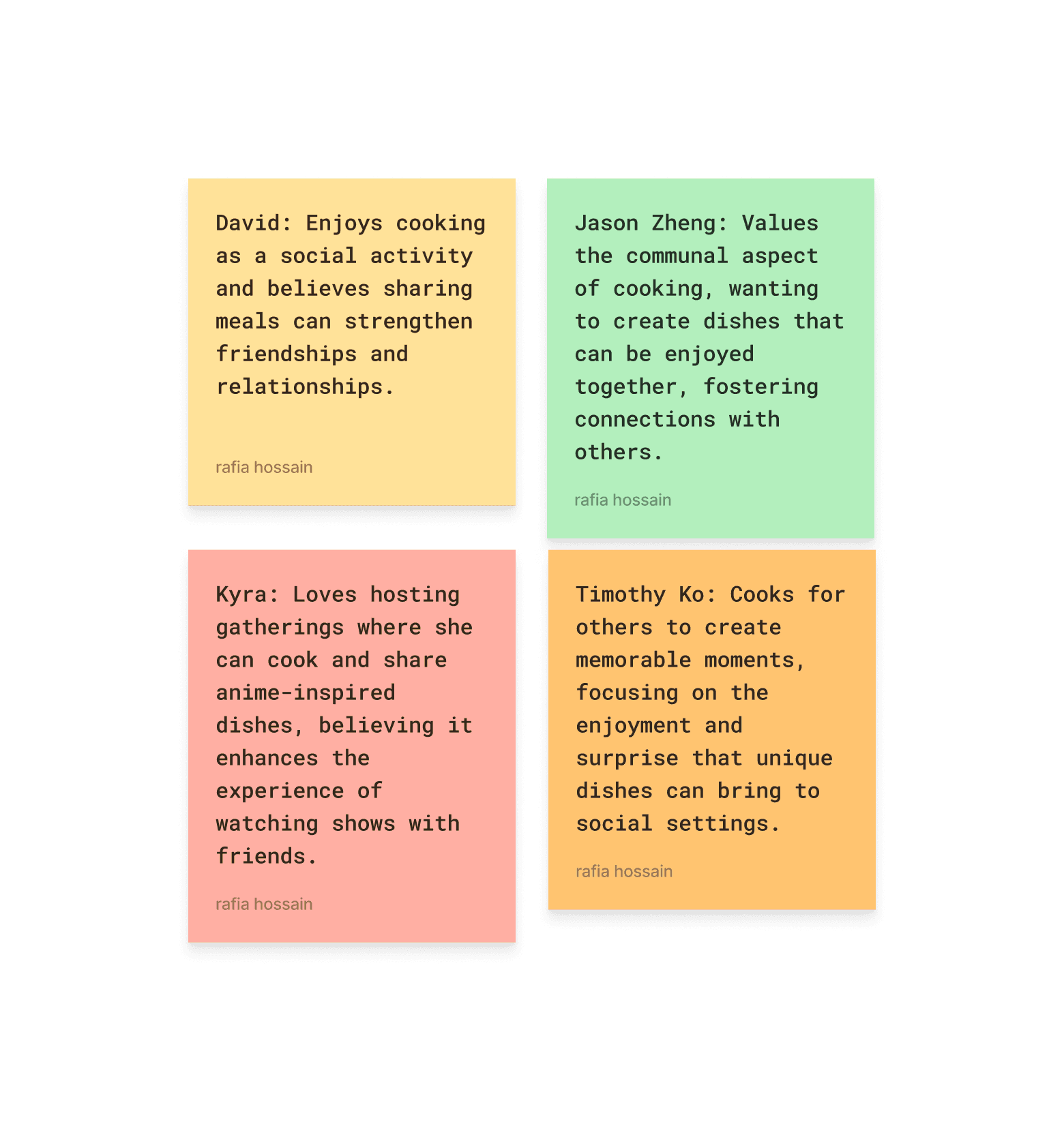
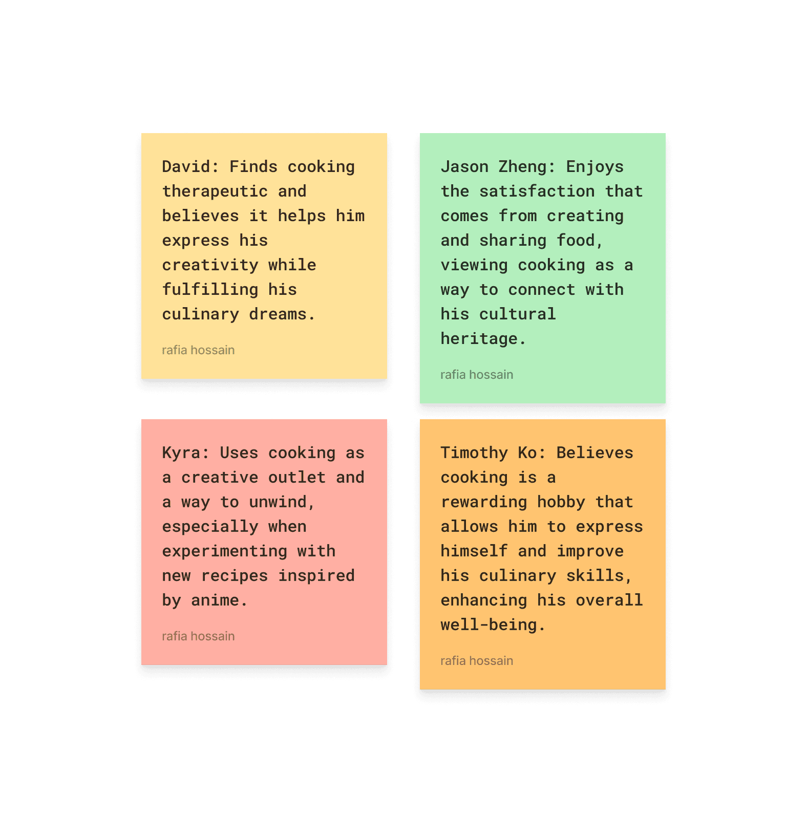
To bridge the gap between research and design, I used an affinity map to group interview insights into five key areas: motivations for cooking, challenges in the kitchen, learning preferences, culinary aspirations and goals, and how users approach recipe selection.
This process helped me identify what mattered most: simple guidance, visual support, and a personalized, judgment-free experience. These themes became the backbone of Bento Buddy’s features, ensuring that every design decision addressed real user needs without adding stress or complexity.
3
Ideate
✦
Design Goals
Make anime-inspired cooking feel accessible and fun.
Use visuals to guide, not overwhelm.
Personalize the experience through onboarding not constant tracking.
Avoid jargon, clutter, and long-winded stories.
Help users build confidence without pressure or perfection.
problem statement
Beginner anime fans need a way to build cooking confidence through clear, step-by-step guidance and personalized support that fits their interests and skill level, without feeling pressured, confused, or intimidated by traditional recipe platforms.
How does This persona Support Mend?
David’s persona helped me design with real users’ busy, sometimes stressed lifestyles in mind. Knowing that he needs simple, clear guidance and flexibility pushed me to create a cooking experience that feels approachable and low-pressure. His desire for personalization inspired the onboarding quiz to tailor recipes and tips to his skill level and preferences. David’s challenges kept the focus on making cooking feel fun and manageable, not overwhelming or like another chore.
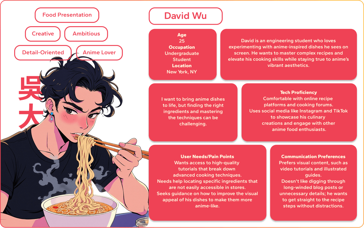
Burnout, time pressure, and flexible cooking
From my user interviews, three key themes emerged around motivation and time constraints. Many participants, including David Wu, a college student juggling classes and part-time work, described feeling too tired or stressed to tackle complicated recipes after a long day. Cooking often felt like one more task on an endless to-do list.
Participants also wanted cooking tools that adapted to their mood and schedule. Instead of rigid step-by-step plans that demanded long focus, they preferred quick, flexible recipes they could adjust based on how much time or energy they had.
Finally, timing and boundaries were important. Users wanted cooking experiences they could fit in easily no pressure to finish a recipe in one sitting or meet strict timers. Something that respected their time and made cooking feel approachable rather than stressful.
2
Define
Key insights FROM USER RESEARCH
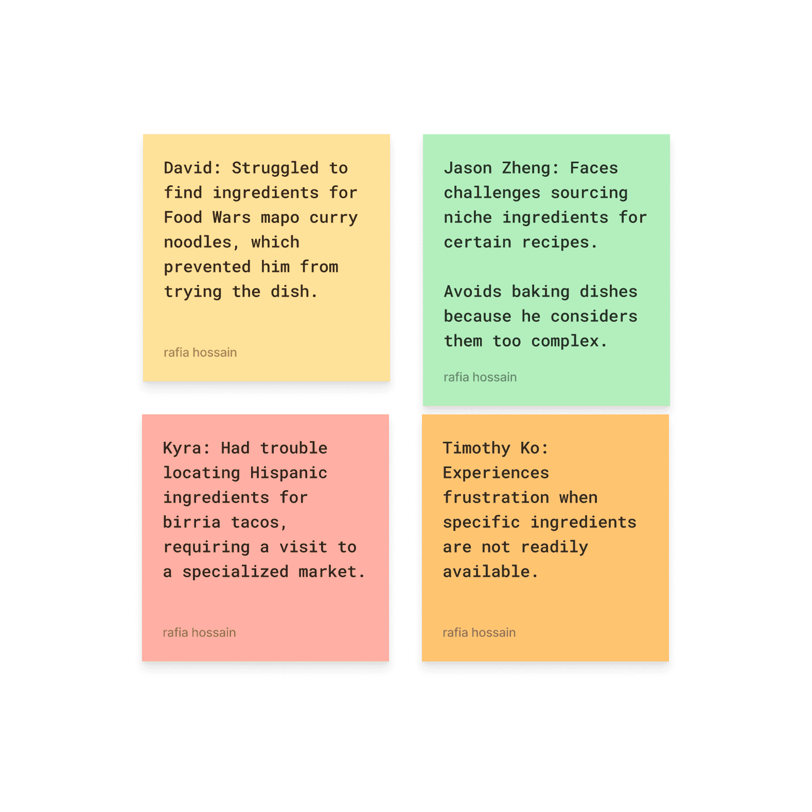
✦ Low Cooking Confidence
“If the recipe looks too complicated, I just give up.”
↪ Users avoided cooking apps that felt overwhelming or assumed a high skill level. They wanted guidance without pressure.
✦ Desire for Simplicity
“I just want to see the steps without scrolling forever.”
↪ Users were frustrated by cluttered interfaces and long recipe intros. They wanted clean visuals, not storytelling.
✦ Need for Personalization
“I wish the app just knew what kind of cook I am.”
↪ Users wanted a more tailored experience. A short onboarding quiz helped gauge their skill level, interests, and goals making the app feel more relevant right from the start.
methodology
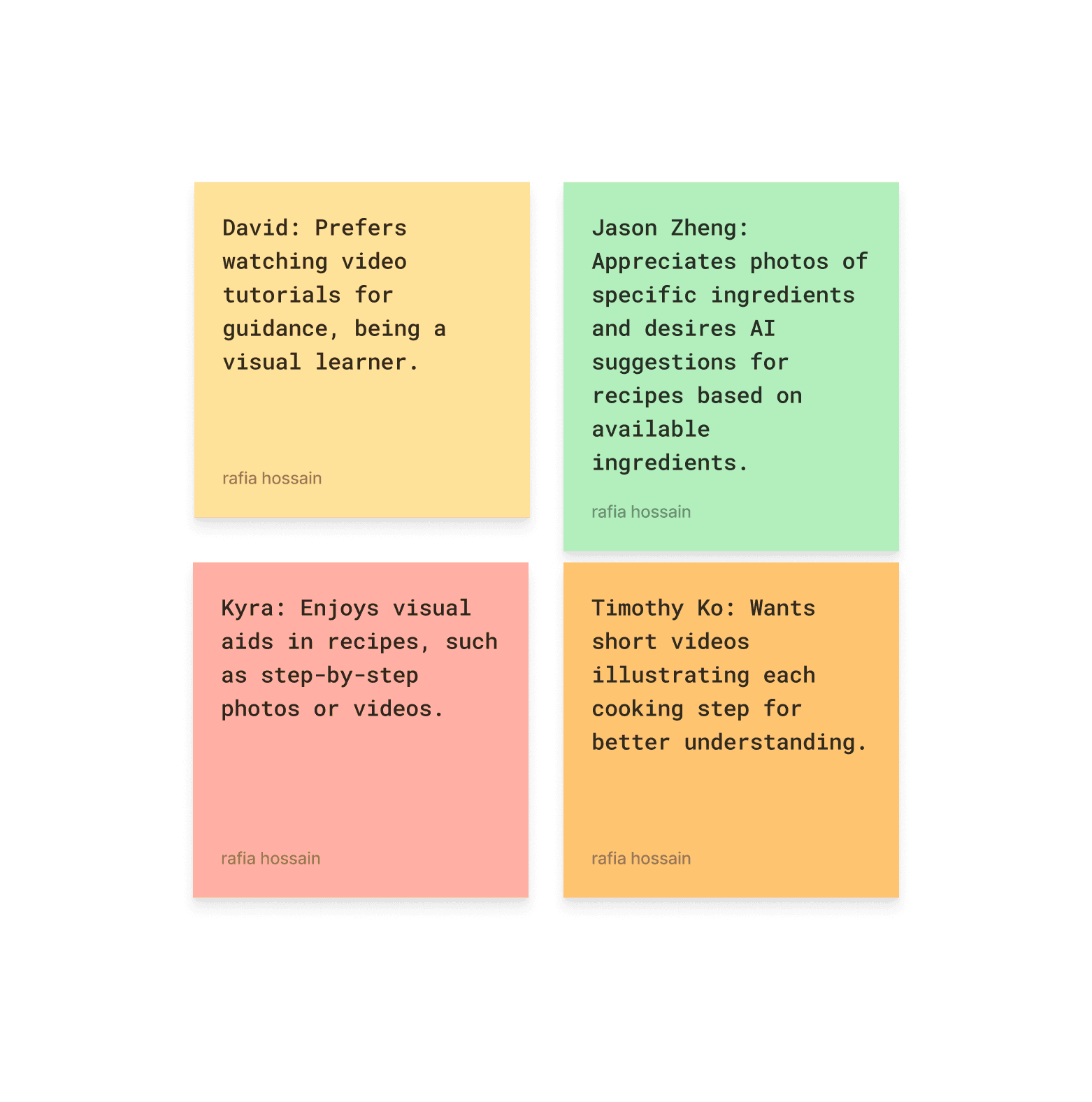
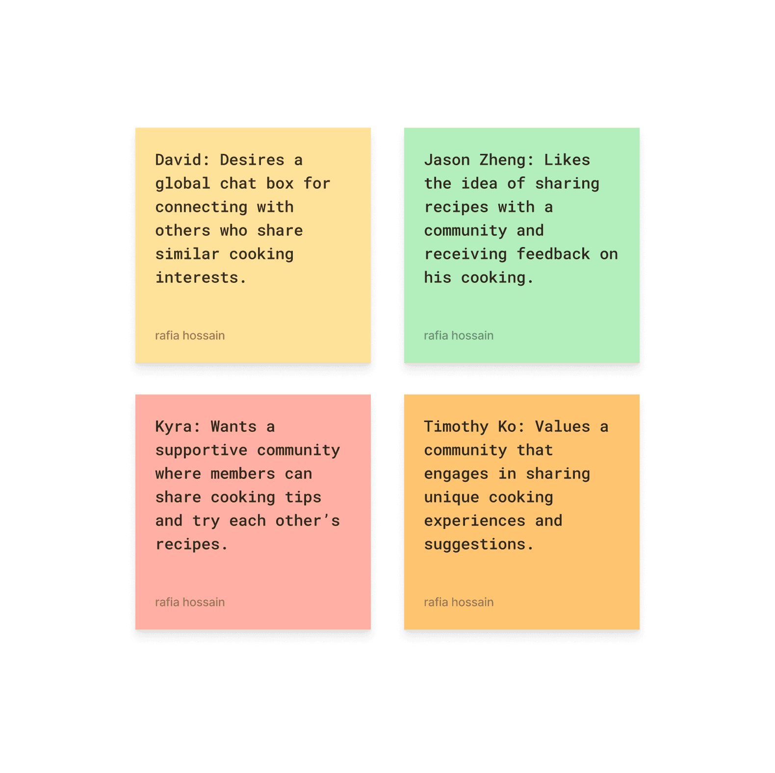
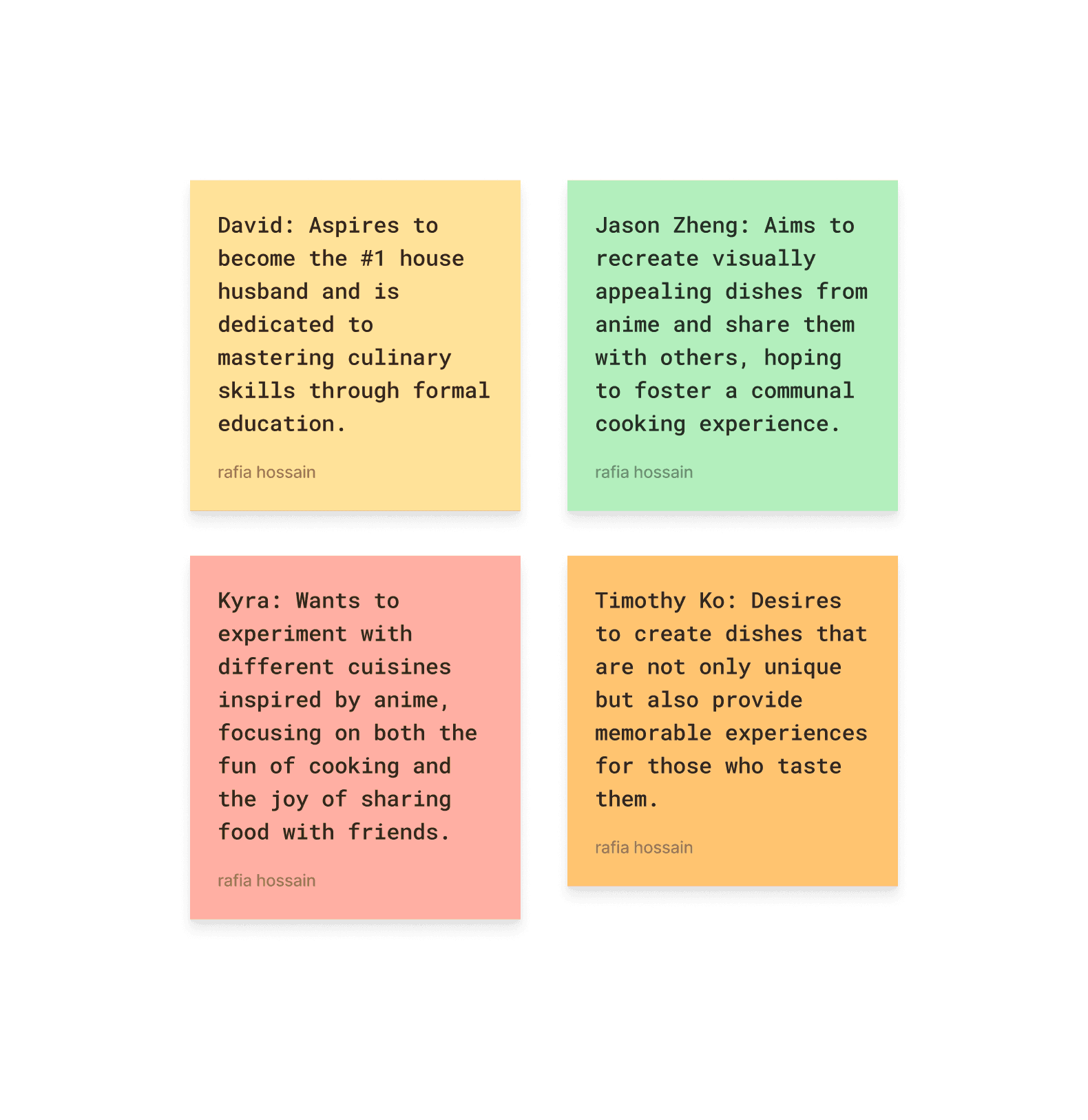
I conducted four one-on-one interviews with participants who were interested in anime-inspired cooking.
The interviews explored their cooking habits, the tools they currently use, and what frustrates or excites them when trying to bring anime meals to life. I used affinity mapping to organize patterns in their responses, which helped surface shared needs and pain points. These insights shaped the foundation of my personas and guided key design decisions throughout the project.
research goals
I wanted to understand what keeps beginner cooks, especially anime fans, from feeling confident in the kitchen. So I focused on three key questions:
(1) What do users emotionally need when trying to learn a new skill like cooking?
(2) Why do they abandon recipe apps even when they want to try new meals?
(3) What would a supportive, low-pressure cooking experience actually look like?

1
Research
TABLE OF CONTENTS
1
4
2
5
3
6
Research
Design
Define
Final
Ideate
Reflection
MY ROLE
As the solo designer and researcher, I led every phase of the project:
User interviews and affinity mapping
Persona development
UX flows and journey mapping
Wireframing and prototyping
UI design and interaction states
Usability testing and iteration
Visual branding and accessibility
THE PROBLEM
Cooking is often seen as a chore instead of a creative, rewarding experience especially for beginners. People who want to learn how to cook often lose motivation when they don't have clear guidance, or a sense of progress.
For anime fans, that frustration is even stronger. They want to recreate the iconic meals from their favorite shows, but are met with scattered recipes, vague instructions, hard-to-find ingredients, and very little support from communities that understand their niche.
THE OUTCOME
Bento Buddy is a playful, mobile-first cooking app designed for anime fans who want to bring on-screen meals to life. It guides users with step-by-step visuals, and light progress tracking all wrapped in an anime-inspired experience. The UX is designed to feel welcoming, creative, and joyful, turning cooking into something fun, not frustrating.
Context
Bento Buddy was born from a small but joyful moment: watching anime late at night and pausing the screen on a perfect bowl of ramen. That single image sparked a question: could I actually make that in real life? Like many fans, I went down the rabbit hole of anime-inspired recipes, only to find that everything was scattered across YouTube channels, personal blogs, and Reddit threads. While the passion was there, the experience was fragmented and often intimidating for beginners.
So I asked: what if cooking anime food felt as delightful and immersive as watching it?
Point of View (POV):
I approached this project as an anime fan who loves cooking but often struggles to translate screen-to-kitchen inspiration into reality. I wanted to design an experience that felt playful, supportive, and community-driven.
How Might We (HMW):
How might we help anime fans cook their favorite on-screen dishes with confidence, creativity, and a sense of shared joy?
Role
UX/UI Designer & UX Researcher
duration
4 weeks
Tools
Figma, FigJam, Google Forms,
Notion
BENTO BUDDY
a self-guided healing platform
case study · 7 min read
Structuring the experience around ease and clarity
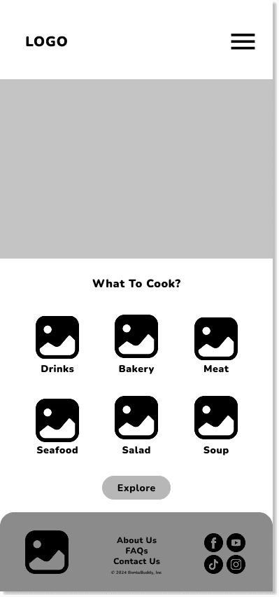
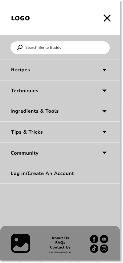
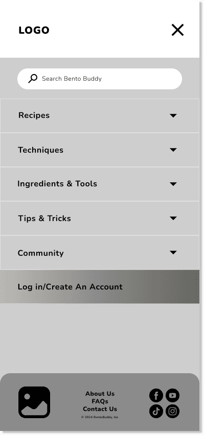
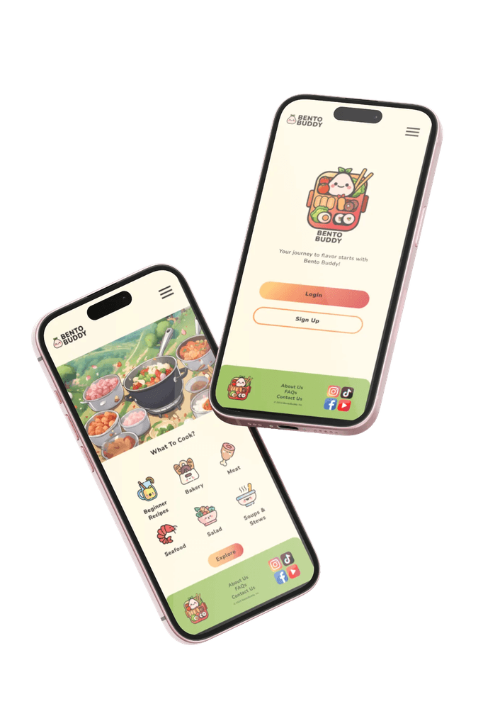
The low-fidelity wireframes focus on Bento Buddy’s core flow, highlighting the main homepage and the hamburger menu that reveals all navigation options. This simple layout emphasizes easy access and clear organization without overwhelming the user.
While I didn’t create screens or prototypes for every feature at this stage, the wireframes helped validate the overall content hierarchy and interaction design. The approach ensures users can quickly find what they need, whether it’s recipes, their personalized quiz results, or settings, keeping the experience light, intuitive, and stress-free.