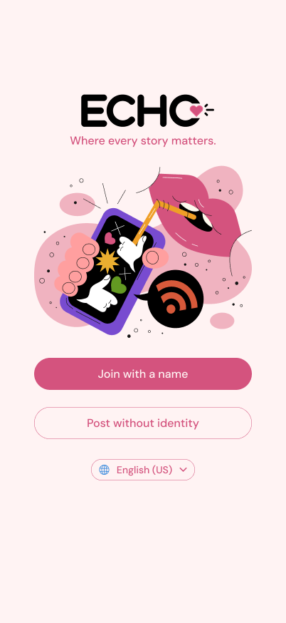
My roleUI lead. I set the visual system and designed the posting flow.
Team4 designers, working over Discord, Figma, and FigJam
Research6 interviews, 7 competitors
TimelineAbout 24 hours, May 2 to 3, 2026. Not tested.
☺♥★
Screens built to the iPhone 17 frame.
The short version
Everyone wanted to share. Nobody wanted to be seen doing it.
The brief
Not a Stranger
Design a mobile app where people share personal stories, openly or anonymously, and others receive them in a way that feels warm and human. The theme was mental wellness.
What we heard
Exposed and performative
Our interviewees wanted to express themselves. They held back because posting felt public, judged, and like a performance for likes.
What we made
Echo
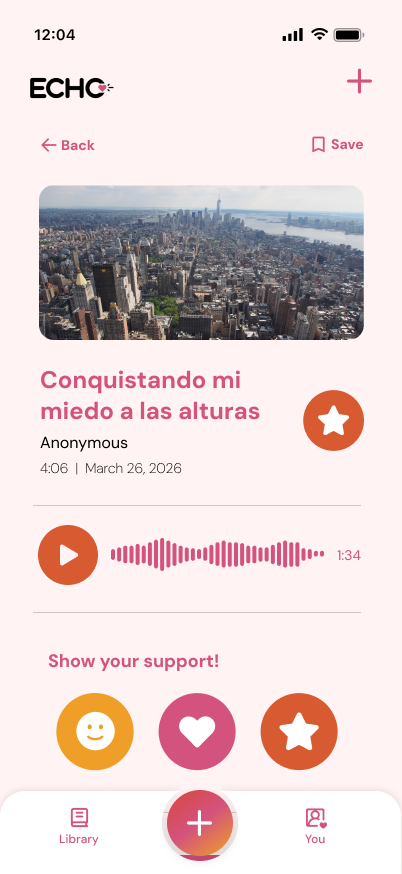
Post with a name or with none. No comments, no like counts. Readers respond with three kind buttons, and AI flags hateful posts before they go up.
The clock
24 hours, roughly.
Kickoff
Brief drops. We read it, then went straight to interviews.
Research
Six interviews, seven competitors, one very full FigJam.
Decide
Vote on the question, split the app into four flows.
Overnight
Team sleeps. I build the base screens and the visual system.
Pitch
Flows filled in, deck made, presented by early afternoon.
The research
Six interviews and a wall of sticky notes.
We split the interviews across the team, and I ran two of the six. Then every quote went on a sticky note, and the sticky notes went into eight piles.
Sharing habits
Barriers to sharing
Emotional needs
Safety and anonymity
Relatability
Digital behavior
Motivation to share
Engagement limits
"Users want to express themselves, but current platforms make it feel exposed, unsafe, and even performative."Our synthesis after affinity mapping.
Seven competitors, one blind spot
We looked at five story-sharing projects and two anonymous apps that shut down.
The Strangers Project
Stories from a Stranger
Meet Cutes NYC
Humans of New York
Letters to Strangers
Yik Yak (shut down)
Whisper (shut down)
The pattern I flagged: every one of the story projects is tied to wherever its founder lives. A stranger's story only reaches you if you're in the same city. That became the case for building Echo for any language, from day one.
Meet Anna. She reads everything and posts nothing.
Fear of judgment
She is afraid of being misread, so she holds back her honest experiences, even with friends.
The passive observer
Scrolling doesn't make her feel part of anything. She wants to step into someone else's shoes.
Lost in translation
When she reads stories from other countries, she worries the important parts didn't survive translation.
The question
Four questions walked in. One walked out.
CutHelp passive users take a first step toward sharing, in ways that connect them to people outside their circle?
CutCreate a path where reading stories from different lives builds the confidence to contribute?
CutDesign a space where meeting difference makes people speak, not just scroll?
ChosenTurn the act of discovering an unfamiliar story into a trusted, judgment-free invitation to share one of your own?
The winner covered the three pain points we ranked highest: distrust of anonymity, fear of judgment, and emotional needs that current platforms miss.
Who did what
Four designers, four flows, one app.
With about 24 hours, we split the app into four flows so we could all design at once. I built the base screens and visual system first, so four people's work came out looking like one app.
Jessica ChangGetting in
The welcome screens, and the choice between joining with a name or posting with none.
Rafia HossainUI lead + posting a story
The base screens, color palette, illustrations, and bottom nav everyone built on. Then the posting flow: feeling, writing, media, anonymity, and sending.
My part
Megan RockReading a story
The story page, the support buttons, and the cultural nuance notes on translations.
Valeria LeeWhen a post breaks the rules
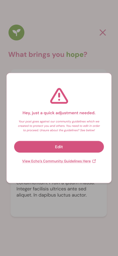
The AI flag that stops a post and asks for an edit.
The UI system
I drew most of the interface. Here's the toolkit.
I set up the base screens, then the team filled in their flows and content. In the end I designed about 90% of the UI. I worked through the night on it while the rest of the team slept, so they woke up to screens they could build on.
Seven feelings, seven colors
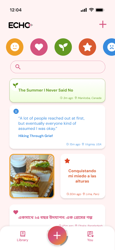
Stories are filed by feeling, so each one got its own color. In the feed you can see a story's mood before you read a word. Every color always comes with an icon and a label, so nothing depends on telling colors apart.
Joy
Love
Hope
Pride
Grief
Shame
Lonely
One soft background
Everything sits on a warm blush pink, with DM Sans for all text. Bright color is saved for feelings and buttons, so the stories stay the loudest thing on screen.
No real faces
I sourced the illustrations and stock photos. People only appear as illustrations, and story photos show places and things, which keeps the app feeling anonymous.
A bottom nav that stays put
Library on the left, You on the right, and a raised + in the middle. It's pinned on every screen, so sharing is always one tap away.
LibraryYou
My flow
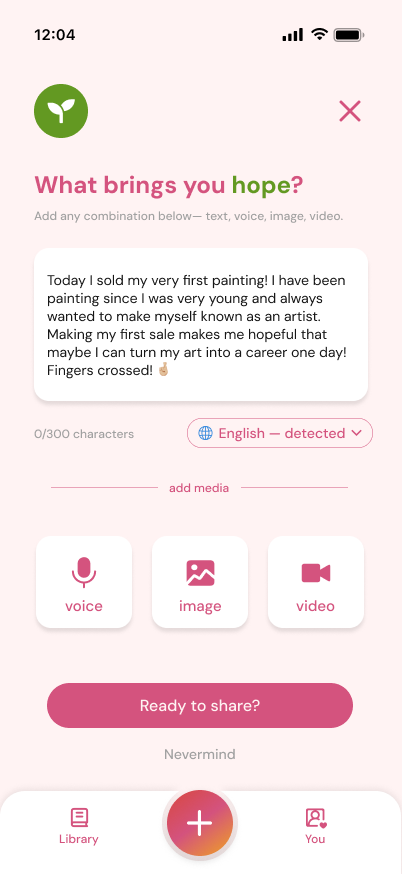
Posting should feel like texting a friend, not doing your taxes.
The brief said it plainly: some people arrive with a story ready, and some want to share but freeze at a blank box. My flow had to work for both.
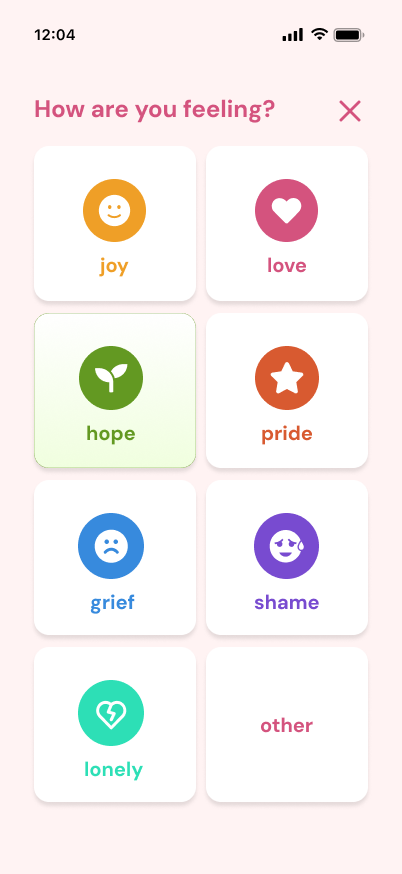
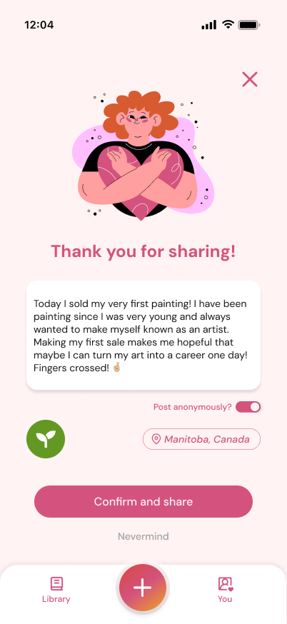
Pick a feelingStart from a mood, not a blank box.→Write it your wayText, voice, image, or video.→Decide who sees your nameOne toggle, right before sending.→SentHeard, with no like count.
Why it works this way
A feeling instead of a blank box
The first question is "How are you feeling?" Picking hope turns the prompt into "What brings you hope?" That gives someone stuck at the start an easy first sentence. The feeling also files the story, so readers can browse by mood.
Any format counts
Not everyone writes. In my brainstorm notes I pushed for not restricting how people express themselves, so voice, image, and video sit right under the text box.
Anonymity decided at the end
People with an account choose "Post anonymously?" on the last screen, once they've seen what they wrote. Posts made without an account are always anonymous. Location shows as a region only, never a city block.
Two ways out, every step
"Nevermind" and "Keep editing" are always on screen. Backing out of something personal should never feel like a mistake.
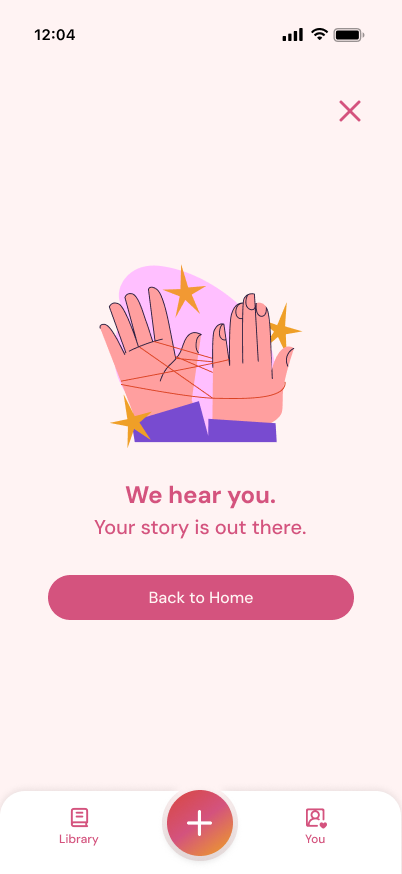
The ending says "we hear you"
No counter starts ticking after you post. The last screen just tells you the story is out there.
The rest of Echo
Where my teammates took it.
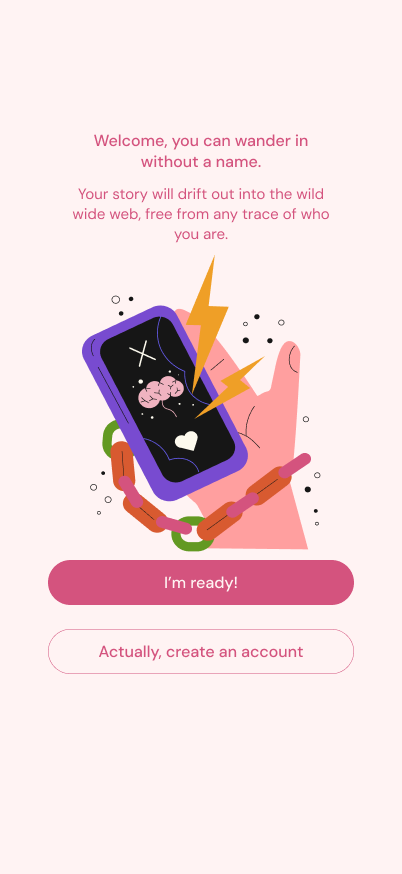
Wander in without a nameFlow by Jessica ChangAnswer with kindness onlyFlow by Megan RockStop harm before it postsFlow by Valeria Lee
A small thing I am proud of
Naming the baby.
The brief called the app "Not a Stranger." I thought it was too long to work as a logo and suggested Kin or Echo. The team picked Echo: when you share a story, it comes back to you through someone who felt the same.
Honest notes
What 24 hours didn't cover.
We designed it in about 24 hours and pitched it. Nobody outside the team has used it, so the main question is still open: do gentle prompts actually get a passive reader to post?
Things I would fix in my own flow first:
The character counter reads 0/300 while there's a full paragraph in the box.
Voice, image, and video show as buttons only. I never designed what happens after you tap them.
If we kept going, I would test the posting flow with five people who read social media but never post, and count how many finish a story.