


RESEARCH
ROLE
SCOPE
STATUS
51 surveys, 5 interviews, 7 languages
UX Researcher and designer
US digital systems, benefits, health, work
Research complete. Concept design.
Luma
A practice space for adult immigrants learning to navigate digital life in the U.S. Research with 51 participants across 7 language communities revealed the real barrier isn't language, it's the fear of making a mistake that can't be undone.
case study
multilingual research
service design
mobile-first concept
THE OUTCOME
The barrier was not language, it was fear. The original assumption was that adult immigrants struggle with digital tasks because of language. The research pointed somewhere sharper and it redefined the product. Acting on the statistics (see below), Luma was scoped as a practice space, not a translator, tutor, or help desk. If the barrier is fear of irreversible mistakes, the highest-leverage move isn't more help. It's a place where mistakes aren't real.

In the U.S., the systems newcomers need the most i.e. benefits, healthcare, employment, their children's schools, are almost entirely digital and in English. Limited English and limited digital fluency compound, locking out the people who need access the most.
Most research misses the emotional layer. The dominant feeling isn't confusion, it is fear. A wrong click can mean a denied claim, a missed appointment, or even money lost. Every task is high-stakes, and there is no safe way to rehearse any of them first.
U.S. systems built for everyone, but them.
01 THE PROBLEM
51 participants across 7 language communities, all living in the U.S., recruited through trusted bilingual intermediaries, never cold outreach,
Older, less digitally fluent, English-uncomfortable immigrants are nearly invisible to standard UX recruiting. I used snowball recruitment through trusted intermediaries: students in an NYC adult-learner program, friends fluent in each language, and community members who shared the survey within their own families. Every participant joined through a relationship of trust.
Reaching people the industry calls "hard to reach."
02 RESEARCH APPROACH

This methodology is usually common in public health but quite rare in the UX industry and was the only way to reach this population. It's also what made the emotional depth of the findings possible.
02 RESEARCH FINDINGS
Seven themes that crossed every community:
01 Fear
02 Belonging
06 Autonomy
03 Dependence
07 Device
04 Scams
05 Forms
75% strongly agreed they fear a mistake with real consequences (4.67/5). Every community scored above 4.0.
Fear is the dominant emotional reality
Signal: The fear held steady across every community, regardless of language or skill level (4.67/5). This isn't a gap that training can close. It's built into how these users experience technology: a place where one wrong move carries real consequences.
FINDING 01
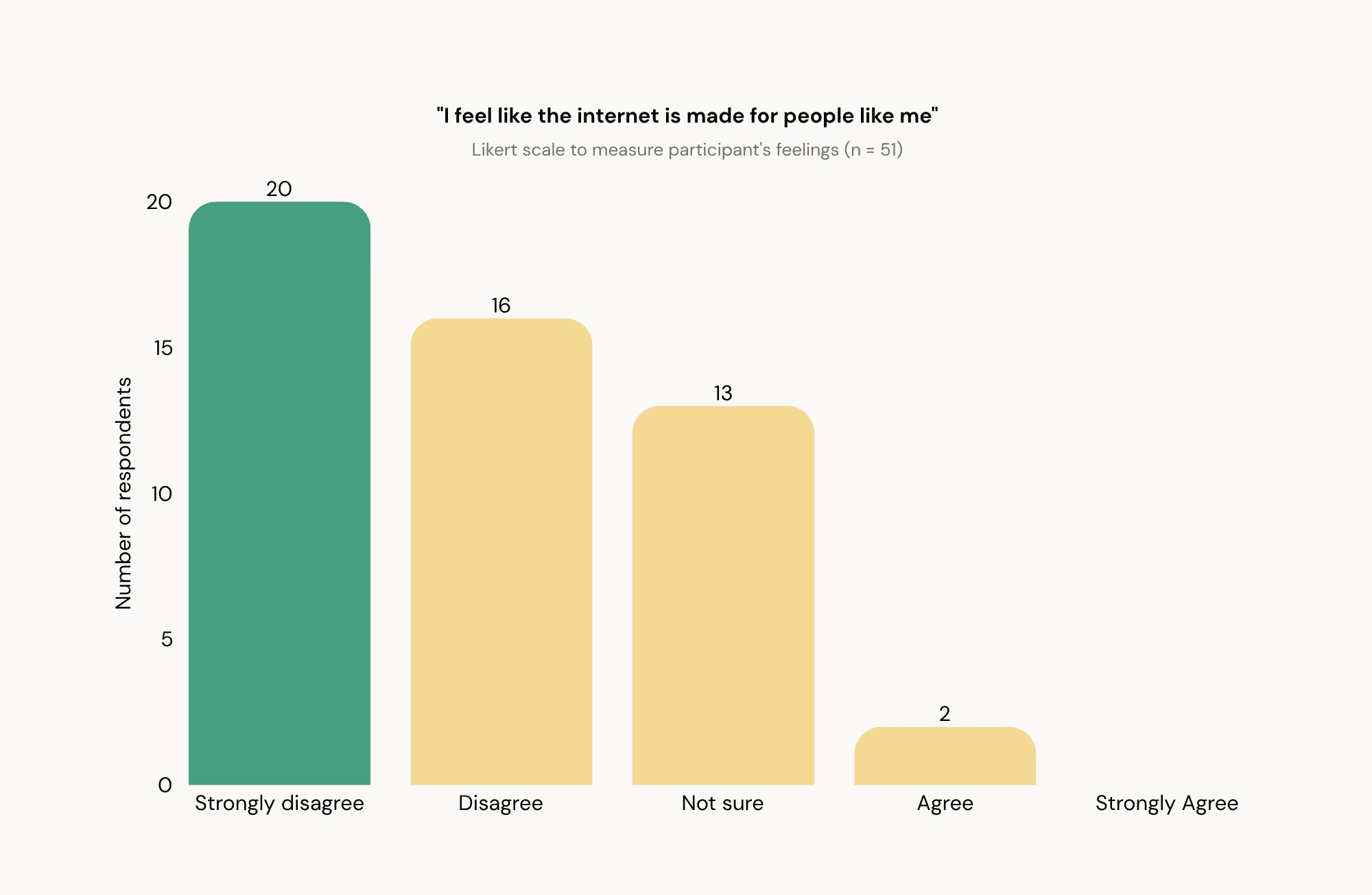
Only 2 of 51 (4%) felt the internet is made for people like them.
(Mean 1.94/5)
The internet doesn't feel built for them
Signal: They're doing high-stakes tasks like immigration, money, and health in a space that feels built for someone else. Every login means real pressure plus a quiet sense of "not for me."
FINDING 02
69% rely on a child or grandchild; 69% have felt embarrassed asking for help from someone.
Dependence is the default, and it carries shame
Signal: Asking your own child for help flips the parent–child role; and that flip is where the shame lives. Luma should build independence.
FINDING 03
69% had almost given their information to a scam; 59% had something go wrong from a wrong click.
Scam exposure is lived experience
Signal: Users do not have a healthy skepticism of the internet. Instead, they developed a fear of it since they have experienced being targeted already.
FINDING 04
My research asked participants how they feel when they fill out forms online: "Scared" was most common (33), then "I avoid it" (22). "Okay" came last.
Forms are emotionally inaccessible
Signal: Forms are the gateway to every essential service as now most things are done digitally. If forms feel like a threat, every threshold becomes one.
FINDING 05
48 of 51 (94%) agreed that one online mistake could cause a real problem in their life, and 38 of them agreed strongly. Just 1 person disagreed. Mean 4.67 out of 5.
Almost no one feels safe making a mistake
Signal: When every action feels permanent and high-stakes, people hesitate, re-check, or avoid the task entirely. Luma should make mistakes feel recoverable, so users can act without bracing for consequences.
FINDING 06
Participants ranged from under a year in the US to over a decade. Just over half (26 of 51) arrived within the last 3 years, while 16 had lived here 5 years or more.
A full range, from brand-new to long-settled
Signal: This spread matters. It lets us test whether digital fear fades with time in the country. It doesn't.
FINDING 07



Insight: Adult immigrants do not fail at digital tasks because they won't do them. They tend to avoid them because the cost of failure is real life and the systems they use give them no place to fail safely first.
Things like fear, dependence, shame, scam exposure, form-avoidance, the longing for autonomy, the reach for phones are not seven separate barriers, but seven expressions of one gap: the distance between needing to do a high-stakes task and having anywhere to rehearse it.
When fear is the structural barrier, the highest-leverage intervention isn't more help, it is the safety to fail.
Seven findings, one structural gap:
05 SYNTHESIS
Six user goals were drawn from the research I conducted, which is translated into eight design principles that governed every screen.
From what users need to how I would build it.
06 USER GOALS & DESIGN PRINCIPLES

Four directions surfaced from the research. Three were rejected because they did not touch the structual barrier.
Why a practice space, and not something else
07 PRODUCT DESIGN

Luma is the rehearsal that happens before the real thing.
Three top-level destinations: Practice, Learn & You. Additionally, a first launch language picker that runs before anything else, because a default-English app contradicts the product's purpose.
Information Architecture (IA)
08 STRUCTURE & FLOWS
The interface is where the research becomes concrete, including the things I chose not to build. But the first question I had for myself was:
Every decision traces back to the research
09 DESIGN DECISIONS & RATIONALE
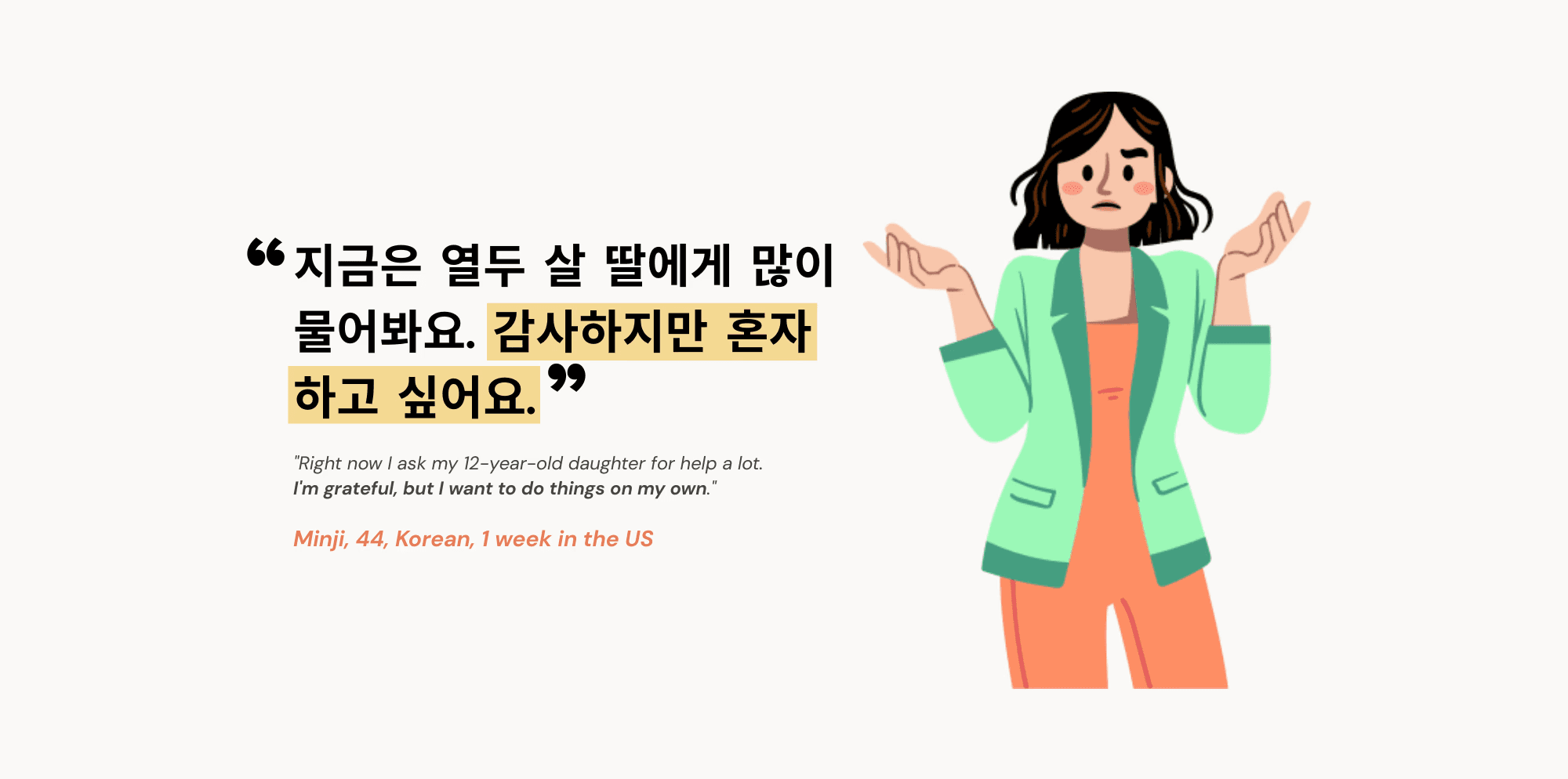
The first time Islam scheduled a doctor's appointment online, she had to get it right. The first time Minji registered her children for school, one week after arriving, she had to get it right. No rehearsal is built into any of these systems.
What this is really about
13 CONCLUSION
The people in this research aren't a target market or a persona. They are adults building lives in a country that didn't make it easy for them. They deserve digital services that take their experience seriously, not as a gesture toward inclusion, but because they're users, they have needs, and they've been left out long enough.
Research conducted independently as a portfolio project. All participation voluntary and uncompensated. Consent obtained in each participant's first language. Bilingual community members translated materials, verified comprehension, and shared the survey within their networks: their contribution was substantial and is acknowledged with gratitude.
Luma is the rehearsal.
Designing for seven communities surfaced the gap between moving words between languages and making an interface, like its pace, tone, structure, and layout direction, read correctly inside someone's cultural context. Luma accommodates this structurally: generous text containers for length variation, layouts that mirror for right-to-left Arabic, tone calibrated per language through native-speaker review, and a language picker as the first interaction. Each language in its own native script, no flags.
Translation is not localization
10 A NOTE ON LOCALIZATION
Five moments my thinking shifted
11 WHAT I LEARNED

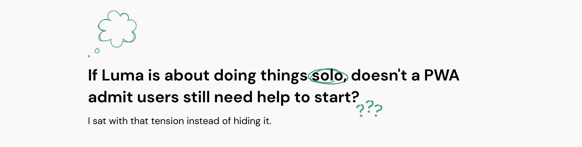
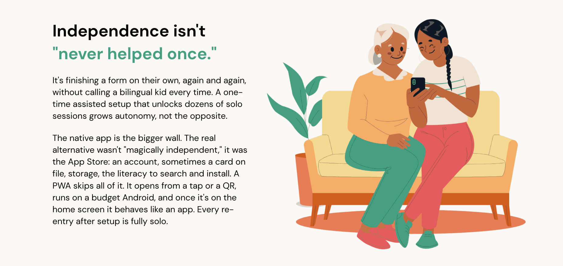
The tradeoff I won't pretend away:
First access has friction. But Luma also teaches users to distrust surprise links (Scams is one of the seven categories), so it can't grow through cold texts. It spreads through trusted, in-person places (ESL classes, libraries, legal aid) where a helper is already present and a printed QR feels safe. I'd validate it with two numbers: first-session completion with vs without a helper, and return-visit rate after install.
A calm civic green, chosen for familiarity:
Not a distinctive brand color. The goal was to feel like the known, legitimate, official-adjacent systems users are preparing to navigate. Familiarity is reassurance. Deep enough for WCAG AAA on white text.




A concept with a real future
12 SO, WHAT'S NEXT?
Test whether a practice sandbox actually reduces fear at the moment of action as the central claim is not yet validated.
Healthcare → banking → jobs, ordered by consequence of failure. Plus human-recorded audio and video per language.
Two screens carry disproportionate weight: the first interaction, and the thesis on trials. Both need dedicated testing.
Adult-ed programs, libraries, health centers, benefits navigators: the same trust channels that made the research possible.
In-language usability testing
Expand tasks, research-first
Refine picker & error states
Distribution via trusted partners
IMMEDIATE
MEDIUM-TERM
SHORT-TERM
LONG-TERM
The content is deliberately US-specific, but the model (rehearsing an unfamiliar high-stakes system before doing it for real) isn't bound to any country. It could localize anywhere, or serve any first-time navigator of an unfamiliar bureaucracy.